4 Understanding Graphical & Statistical Procedures
Data for this section: section4_1_data.sav, section4_2_data.sav
4.1 Thinking About Statistics
Statistics is in a sense a giant toolbox containing a collection of graphical and statistical procedures.
Each graphical or statistical procedure is good for a particular situation we may run into while doing data analysis. The main purpose of any graphical and statistical procedure is to investigate a variable or the relationships between variables. That is a very important concept!
THE MAIN PURPOSE OF ANY GRAPHICAL OR STATISTICAL PROCEDURE IS TO INVESTIGATE A VARIABLE OR THE RELATIONSHIPS BETWEEN VARIABLES.
Keep in mind that graphical procedures can be more valuable to you than statistical procedures. You should try to express your results in graphs whenever you can.
It is not hard to implement or interpret any graphical or statistical procedure once you understand and can explain the procedure. SPSS is very helpful in both regards. The biggest challenge facing any researcher is to know the most appropriate procedure to apply in any particular situation.
The types of the independent and dependent variables (predictors and outcome) will guide your choice for the appropriate graphical and statistical procedure.
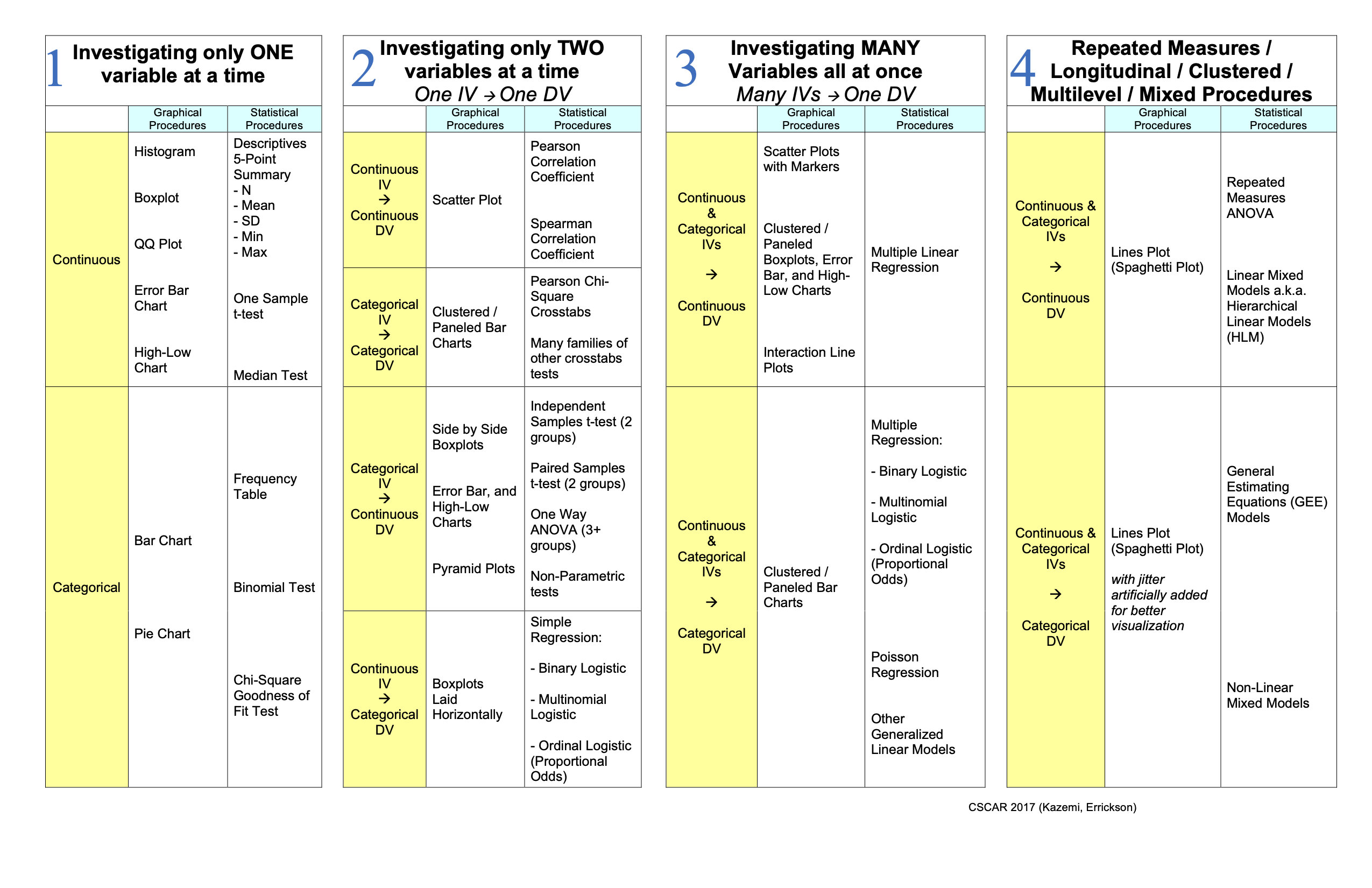
Just like in many things in life, the 80/20 rule somewhat applies to statistics. There are a small number of procedures that you will use more repeatedly than others. Here, we will divide those essential procedures, graphical and statistical, into 4 major classifications:
- One Variable Only Procedures
- One-on-One Procedures investigating two variables at a time
- Many-on-One Procedures
- Repeated, Longitudinal, Clustered, Multilevel, and Mixed Procedures
4.2 Correlation vs. Causation
The presence of a correlation between two variables DOES NOT imply that there is causation between them. Any of the three scenarios below could explain the correlation between two variables A and B. We can’t tell using statistics alone which scenario it is.
- A causes B
- B causes A
- C causes both A and B
4.3 Everything On One Page Handout
The chart below lays out the essential graphical and statistical procedures by type and classification.
4.4 Parametric vs. Non-parametric Tests
There are varying assumptions that underlie the validity of each statistical procedure. A common assumption for statistical procedures is that the samples being analyzed should come from an underlying normal distribution. If this is not a reasonable assumption, you can use non-parametric tests. Non-parametric tests do not have this distributional assumption, and generally use ranks in the place of the raw scores. The table below gives non-parametric tests that are equivalent to common parametric tests.
| Parametric Test | Non-Parametric Test |
|---|---|
| Pearson Correlation Coefficient | Spearman Correlation Coefficient |
| Independent Samples t-test (2 groups) | Mann-Whitney / Wilcoxon Rank Sum Test (2 Groups) |
| Paired Samples t-test (2 groups) | Wilcoxon Signed Rank Tests (2 Groups) |
| One Way ANOVA (3+ groups) | Kruskal-Wallis Test |
| Repeated Measures ANOVA | Friedman’s Test |
| Chi-Square Test | Fisher’s Exact Test |
4.5 Basic Summary Statistics (Investigate One Variable at a Time)
As the name implies, One-Variable-Only Procedures help us investigate a single variable at a time. They can tell us about the frequency distribution of a categorical variable (Frequency Table, Mode, Bar Graph, Pie Chart, etc.). They can give us insight into the central tendency of a continuous variable (Mean, Median, Mode, etc.). They can help us test a hypothesis about the mean of a variable (One Sample t-test). They can give us insight into the dispersion of a variable (Standard Deviation, Range, Inter-Quartile Range, Boxplots, Error Bar Plots, etc.). They can also give us insight into the relative position of any data point with respect to the other data points in a variable (Percentiles, Quartiles, Boxplots, etc.).
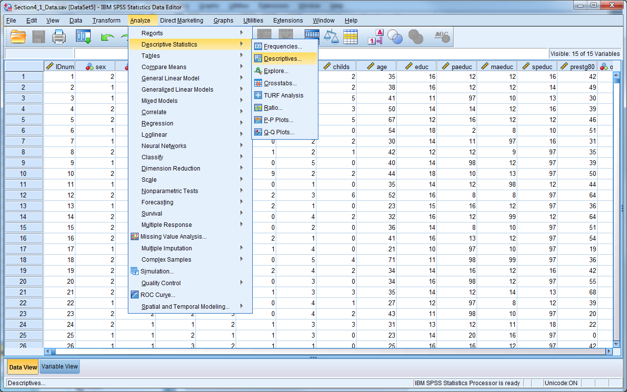
In SPSS, there are two procedures which provide simple descriptive statistics. You can find both procedures under Analyze -> Descriptive Statistics.
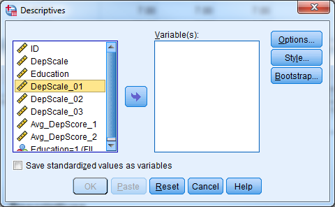
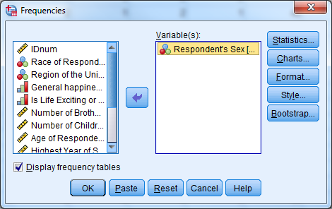
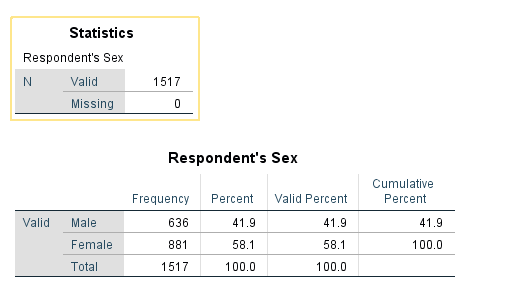
Frequencies procedure provides the number and % of cases which have each value of a variable (e.g., 46% male, 54% female). You can request other output by clicking Statistics. Frequencies are most useful for categorical variables.
Try it: Use section4_1_data.sav. Obtain the frequency (descriptive) statistics for the variable Sex.
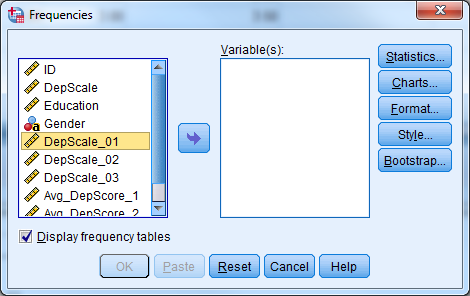
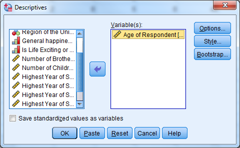
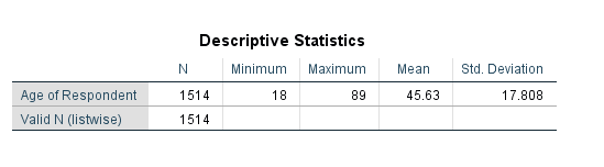
Descriptives provides the mean, standard deviation, minimum, maximum and non-missing sample size by default. Other statistics are available by clicking Options. Descriptives are most useful for continuous variables, and sometimes useful for ordinal data (categorical data with ordering, e.g., small, medium, large) alongside the frequencies.
Try it: Use section4_1_data.sav. Obtain the descriptive statistics for the variable Age.
As a first step in data analysis, one might run frequencies on all categorical variables and descriptives on all continuous variables. Obtaining descriptive statistics is an important step to detect possible data entry errors.
4.6 Visualizations
There are two methods for creating charts in SPSS, Chart Builder and Legacy Dialogs. (There is a third method, in which other analysis methods create their own graphics, but we’re covering only direct creation of graphics here.)
The newer approach is Chart Builder, which is a more free-form approach. It has a steeper learning curve but is ultimately more powerful.
The classic approach is legacy dialogs which are much easier to use, but more restrictive in the types of plots they can create.
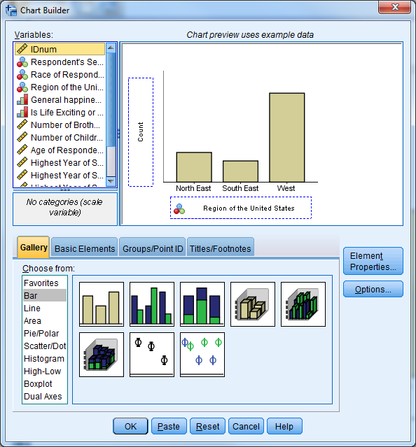
4.6.1 Chart Builder
To create a graph in “Chart Builder”, first select the type of graph that you would like to create by dragging and dropping the appropriate graph image to the “Chart Preview” area. Once you select a chart, the Element Properties window will appear. The Element Properties window allows you to modify what is displayed in the graph
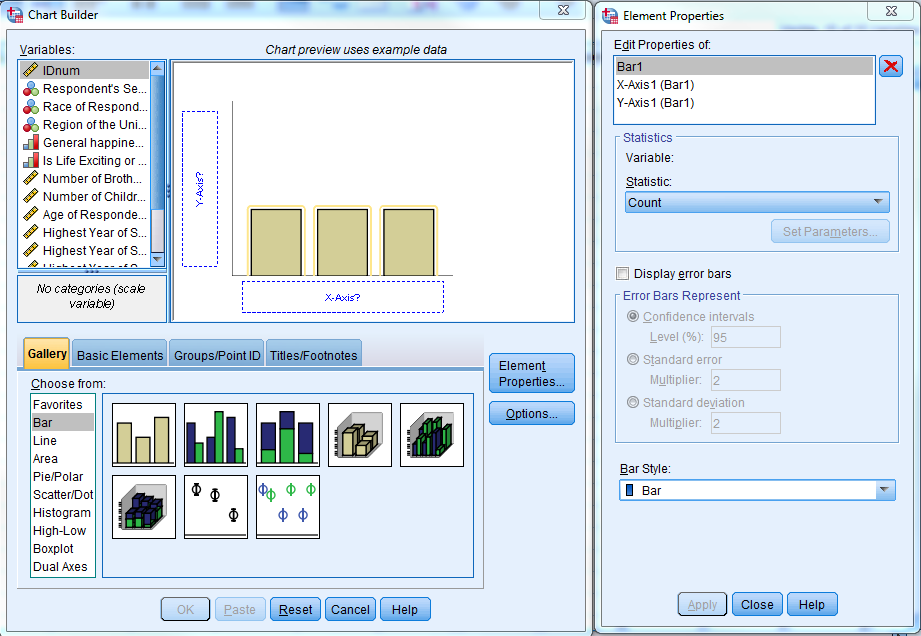
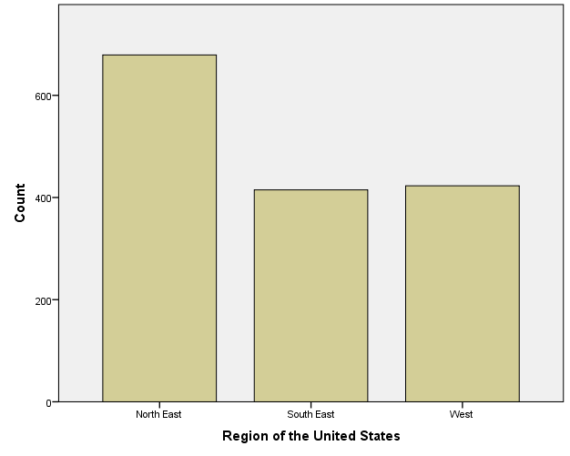
Try it: Use section4_1_data.sav. Create a simple bar chart for “Region”.
4.6.2 Legacy Dialogs
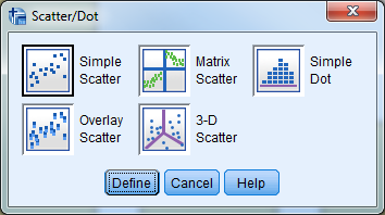
The “Legacy Dialogs” interface requires that you determine the type of graph you would like to create before providing a dialog box, which is similar to other procedures in SPSS. After you select the general type of graph or chart, SPSS will then prompt you to be more specific. If the general form is a scatter plot, for example, SPSS will ask you to then specify which type of scatter plot you would like to create. The software will present you with the graphing dialogue box once you specify the specific form for the graph.
Try it: Use section4_1_data.sav. Create a simple bar chart for “Region”.
4.7 Normality
Many statistical procedures assume “normality”, which means the population which the data is from follows the Normal Distribution. You may know this as the “bell curve”.

Many real-life variables follow a normal distribution such as height. If you were to collect a random sample of heights, most people would fall near the mean height for the population. Some people would be much taller or shorter, and a very limited number of people would be extremely short or extremely tall.
The normality assumption as written is usually quite strict; in practice we often loosen it. Rather than “The data comes from a normal population”, you can think of it as “The data comes from a population that’s not too badly non-normal.” Essentially, you’re looking for major violations of normality, rather than trying to determine whether the bell curve perfectly fits your data.
Finally, a large sample size oftens “protects” you from normality violations; the larger the sample size, the more extreme a normality violation needs to be to be a concern.
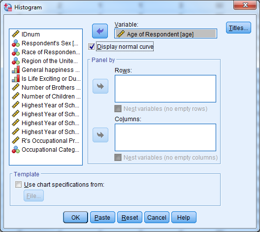
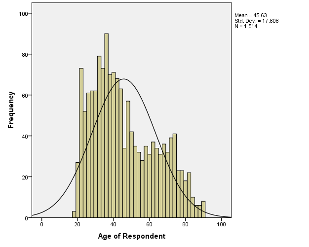
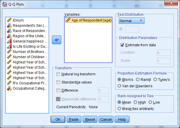
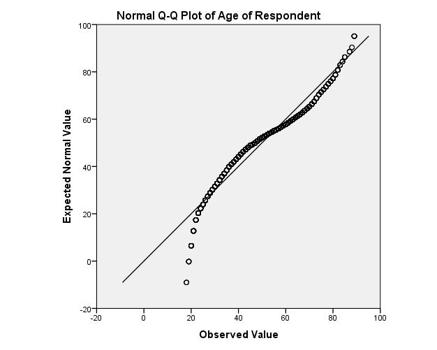
While there are formal tests of normality, typically assessment is done with a histogram (looking for that bell shape) or a QQ-plot, which looks for its values to fall along the 90° line. The histogram can be created from the Histogram Legacy Dialog, the QQ-plot is created under Analyze -> Descriptive Statistics -> QQPlot.
Try it: Use section4_1_data.sav. Obtain a histogram for the variable “Age” and display the normal curve. Obtain a QQ plot for the variable “Age”. Hint: Analyze -> Descriptive Statistics -> QQPlot.
4.8 Exercise 8 – Data Exploration and Visualization
Open exercise8_data.sav
Part 1: Investigate the variable attributes. Determine which variables are categorical variables (nominal and ordinal), and which
ariables are continuous (scale). Obtain the appropriate descriptive statistics for each variable. Remember, continuous variables should be investigated with descriptives and categorical variables should be investigated with frequency tables.
Hint: Select more than one variable in the Analyze -> Descriptive Statistics -> Descriptives, or Analyze -> Descriptive Statistics -> Frequencies dialog boxes.
Part 2: Assess the distribution of the Occupational Prestige Score (“prestg80”) with both a histogram (normal curve displayed) and a Q-Q plot. Is the assumption that the population of Occupational Prestige Scores is normally distributed reasonable?
Part 3: Compare the average highest year of school completed (“educ”) for males and females.
Hint: First split the file by “sex” (Data -> Split File), then calculate the descriptive statistics. Be sure to return to the Split File menu when you are done with this question and return the dialog box to “Analyze all cases”.
Part 4: Produce a pie chart for the variable “region”. (We didn’t cover this, you can use either Chart Builder or Legacy Dialogs.)
4.9 Investigating Two Variables at a Time
The main purpose of any graphical and statistical procedure is to investigate a variable or the relationships between variables. We start by examining the relationship between variables using simple two-variable procedures. The type of independent and dependent variables that you would like to investigate determines the appropriate statistical or graphical procedure. Remember that the presence of a correlation between two variables DOES NOT imply that there is causation between them.
4.9.1 Pearson Correlation Coefficient & Scatterplots
The Pearson Correlation Coefficient measures the linear association of two continuous variables. A scatterplot is an easy way to visually explore the association between two variables. When you plot the variables together, you obtain a clear sense of the overall relationship between the two variables.
The Pearson Correlation Coefficient (Pearson’s r) varies from -1 to +1. A value of zero indicates that there is no linear relationship between the two variables, a value of +1 indicates that there is a perfect positive linear relationship, and a value of -1 indicates that there is a perfect negative relationship. Positive relationships imply that variable 2 increases when variable 1 increases, and vice versa, while negative relationships imply variable 2 increases when variable 1 decreases, and vice versa.
The statistical significance of a correlation is the chance that you would observe a correlation that high or higher if there really was no correlation between the variables.
For the Pearson Correlation Coefficient in SPSS, select Analyze -> Correlate -> Bivariate.
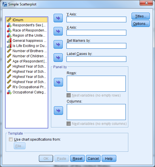
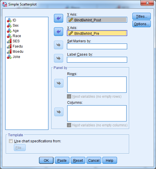
For the Scatterplot in SPSS, select Graphs -> Legacy Dialogs -> Scatter/Dot, choose “Simple Scatter”, and click “Define”.
Try it: Use section4_2_data.sav Investigate the correlation between the individual behavior intention scales.
- Select Analyze -> Correlate -> Bivariate.
- Select “BIndBehInt_Pre” and “BIndBehInt_Post”.
- Select “OK”.
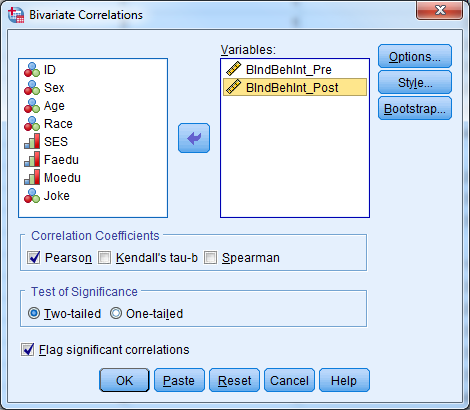
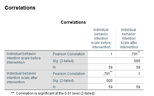
The table indicates that there is a significant correlation between the pre intervention and post intervention behavior scale scores. Our p-value (Sig (2-tailed)) is less than our predetermined 0.05 level of significance, so we reject the null hypothesis that there is not an association between these two variables. The correlation coefficient is positive, indicating that high scores for one variable correspond to high scores for the other variable. Conversely, low scores for one variable correspond to low scores for the other variable. Individuals who scored high on the pre-test also tended to score high on the post test.
To visually investigate this relationship, use a scatterplot:
- Select Graphs -> Legacy Dialogs -> Scatter/Dot.
- Select “Simple Scatter” and “Define”.
- Select “BIndBehInt_Post” for the Y Axis.
- Select “BIndBehInt_Pre” for the X Axis.
- Select “OK”.
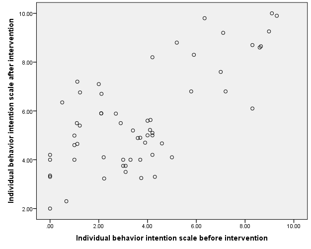
The scatterplot indicates a linear relationship between the two variables.
4.9.2 Pearson Chi-Square Crosstabs and Test of Independence
The Chi-square test is very common way to explore the relationship between two categorical variables. This tests the null hypothesis that there is no relationship between the two variables, and rejecting the null hypothesis allows us to conclude that the variables have a statistically significant relationship with each other.
Suppose that we’re interested in determining if there is a significant relationship between smoking status and lung cancer status. Our variables are:
- Smoking Status (1=Yes, 0=No) , and
- Lung Cancer Status (1=Diagnosed, 2=Not Diagnosed).
We can summarize these variables in a 2x2 table called a crosstab where the cell values represent the counts in our data that fall in those particular categories. We can perform a Chi-square test to determine if there is a relationship between smoking and lung cancer.
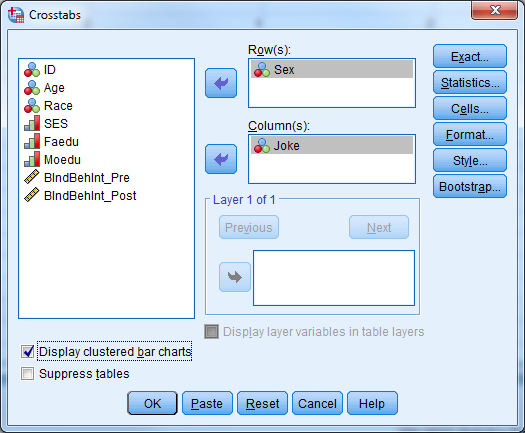
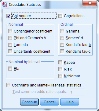
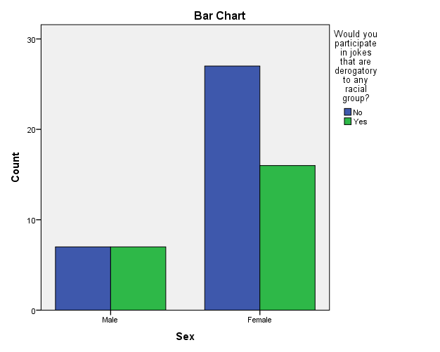
Select Analyze -> Descriptive Statistics -> Crosstabs for the Chi-square test of independence and make sure to check the box “Chi-Square” under “Statistics”. You can produce a clustered bar chart to visualize this table by checking the box for “Display Clustered Bar Chart” in the “Crosstab” dialog box.
Try it: Use section4_2_data.sav. Are females more likely to participate in jokes that are derogatory to any racial group? Investigate the data to see what types of variables we have to answer this question. We have the categorical variable “Sex” and the categorical variable “Joke”. Since we are comparing two categoricalvariables, we will use a Chi-square test.
- Select Analyze -> Descriptive Statistics -> Crosstabs.
- Select “Sex” for rows, “Joke” for columns, check the box to “Display clustered bar charts”.
- Select “Statistics” and check the box for “Chi-Square”.
- Select “Continue” and the select “OK”.
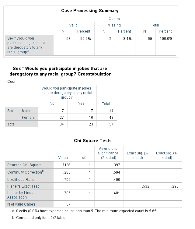
The results above indicate that there is not a significant difference between how females and males answered the question “Would you participate in jokes that are derogatory to any racial group?” (p-value=0.397).
4.9.3 Two-Sample T-Test and One-Way ANOVA
The purpose of the two-sample t-test, also known as the independent samples t-test, is to determine if mean values of a particular continuous variable are significantly different for two groups. The one-way analysis of variance (ANOVA) is mathematically equivalent to the two-sample t-test, and is appropriate when there are two or more groups.
There are 3 assumptions that must be met in order to perform these tests:
- Normality
- Homogeneity of variance for ANOVA
- Independence of groups and observations
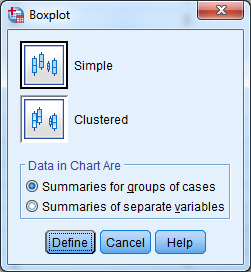
You can investigate normality with Q-Q plots or histograms and use Levene’s test to assess homogeneity of variance. You can also side-by-side box plots to investigate the relationship between a continuous dependent variable and a categorical predictor.
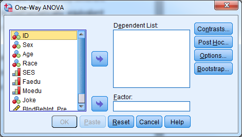
In SPSS, select Analyze -> Compare Means to find the two-sample t-test and one-way ANOVA
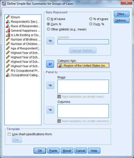
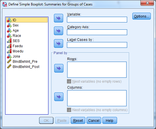
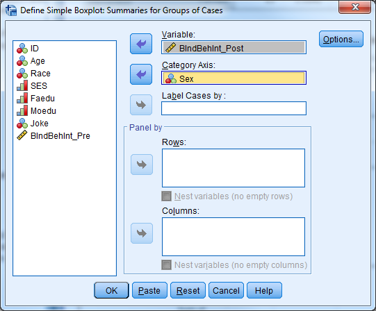
For the side-by-side box plots, select Graphs -> Legacy Dialogs -> Boxplot, choose “Simple” and “Summaries for groups of cases”, and click “Define.” In the next dialog, move the continuous variable and the grouping variable from the left-hand list of variables to the “Variable” and “Category Axis” boxes.
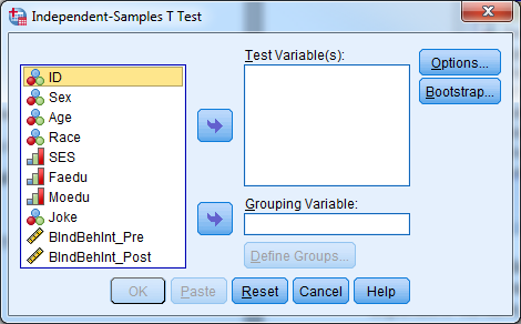
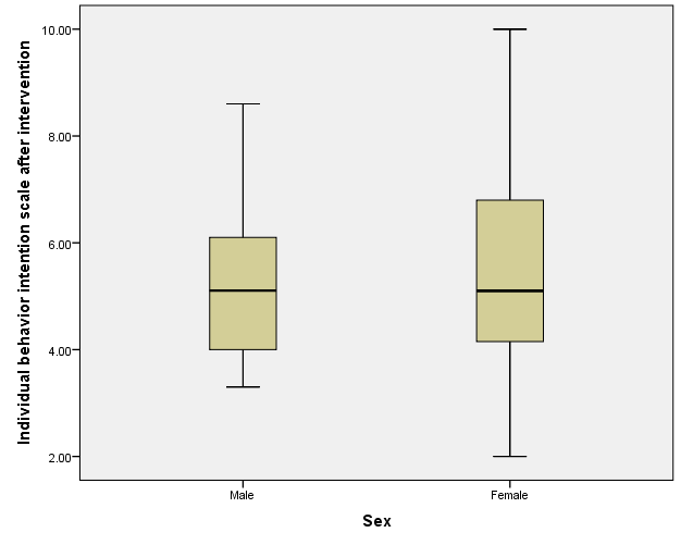
Try it: Use section4_2_data.sav. Is there a relationship between sex and the post intervention intension scale score? Sex is a categorical variable, the intension scale is continuous. We can use either an independent samples t-test or one-way ANOVA.
- Select Analyze -> Compare Means -> Independent Samples T Test.
- Select “BIndBehInt_Post” for TestVariable(s).
- Select “Sex” for Grouping Variable.
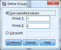
- Select “Define Groups…” and let group 1=1, group 2=2.
- Select “Continue” and “OK”.
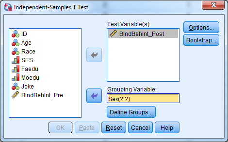
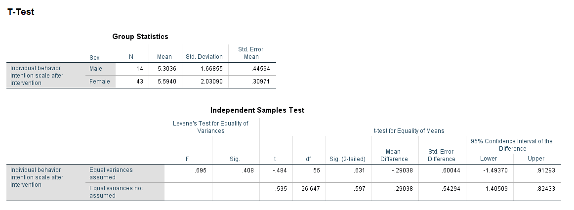
The tables above indicate that the males and females have similar average intension scale scores (males=5.3, females=5.59). We fail to reject the null hypothesis for Levene’s test, so we will report the information for “Equal variances assumed”. Our p-value is .631, so we fail to reject the null hypothesis that males and females have similar average intention scale scores.
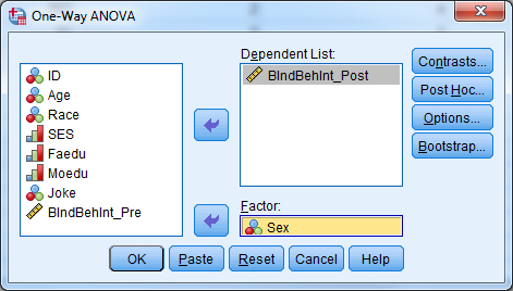
- Select Analyze -> Compare Means -> One-Way ANOVA”.
- Select “BIndBehInt_Post” for the dependent list.
- Select “Sex” for the factor.
- Select “OK”
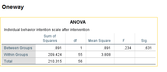
The ANOVA table above yields the same p-value and conclusion as using the two-sample t-test.
- Select Graphs -> Legacy Dialogs -> Boxplot.
- Select “Simple” and “Summaries for groups of cases” and click “Define”.
- Select the continuous dependent variable for “Variable” and the grouping variable for “Category Axis”.
- Select “OK”.
4.9.4 Paired T-Test
A paired t-test, also known as a repeated measures t-test or dependent samples t-test, is appropriate when there are two related observations (variables) and we want to determine if the average values of these variables differ from one another. The purpose of the paired t-test is to test the same units of observation under different treatment conditions to see if a treatment effect exists. The test compares the pre-treatment value to the post-treatment value for each case.
The null hypothesis is that the mean value of the differences for these two related variables is 0. If we reject this hypothesis, then we conclude that the difference is significantly different from 0. This test assumes that the sample mean of the differences is normally distributed. The test only considers cases with both pre-treatment and post-treatment values.
In SPSS, select Analyze -> Compare Means -> Paired Samples T-Test.
Try it: Use section4_2_data.sav. Investigate whether or not the average intention scores are statistically different from each other. Since these variables are pre and post variables, it would be interesting to see if the intervention was successful in increasing the scores of participants. To investigate this, we will use a pairedt-test.
- Select Analyze -> Compare Means -> Paired Samples T-Test.
- Select “BIndBehInt_Pre” for Variable 1.
- Select “BIndBehInt_Post” for Variable
- Select “OK”.
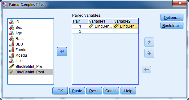
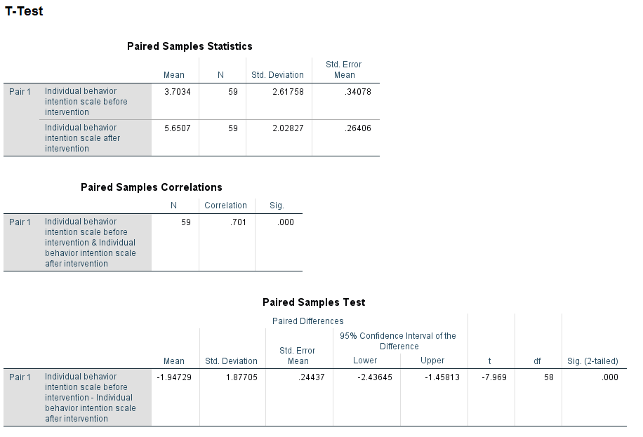
The tables above indicate that there is a significant increase in average behavior intention score after the intervention (p-value<.001).
4.10 Investigating Many Variables at a Time
It is often useful to investigate the relationship between one outcome variable and multiple predictor variables. The type of the outcome variable determines the appropriate model; general linear models are appropriate for continuous outcomes and generalized linear models are appropriate for categorical outcomes. General linear models include simple linear regression and multiple linear regression while generalized linear models include binary logistic regression and ordinal logistic regression. Linear regression and binary linear regression will be covered through EXERCISES in this workshop, time permitting.
4.11 Repeated Measures, Longitudinal, Clustered, Multilevel, Mixed Procedures
It is very common in many studies to take multiple measurements on a unit of analysis, typically a subject. These multiple measures may be occurring over time, conditions, regions, or the levels of any other variable. Depending on what the measurements are taking place over, there are many names we give these studies. It is also very common in many studies to have the units of analysis be clustered (i.e. grouped) into higher level clusters (i.e. groups). Sometimes the clusters themselves are further clustered into even higher level clusters, and so on.
In all of these studies, we must use more advanced statistical procedures that take into consideration the possible correlation of observations that are coming from the same unit of analysis. While using advanced procedures to analyze such data sets is beyond the scope of this workshop, you should be able to identify these multilevel data sets and discuss them with your statistician.
4.12 Other Procedures in SPSS
Here is a non-exhaustive list of other procedures in SPSS that you may use:
- Tests for checking the assumptions of normality
- Intraclass correlation coefficient
- Partial correlations
- General linear models
- Generalized linear models
- Categorical data analysis
- Randomized clinical trials
- Case-control clinical trials
- Matching and propensity scores
- Survival analysis
- Cox regression
- Two-stage least squares regression
- Probit regression
- Cluster analysis
- Discriminant analysis
- Factor analysis
- Principal components analysis
- Reliability analysis
- Path analysis
- Structural equations modeling
- Latent class analysis
- Multidimensional scaling
- Spatial statistics
- Time series analysis
- Complex samples and survey methodology
- Missing data analysis and imputation
- Geographical information systems
- Qualitative data analysis
- Text mining
- Receiver operator characteristic (ROC) curve analysis
- Functional data analysis
- Data mining
- Classification and regression trees (CART)
- Chi-square automatic interaction detection (CHAID)
- Neural networks