5 Appendix
5.1 Interpreting Interactions in a Regression Model Overview
5.1.1 Two-Way Interactions
5.1.1.1 General
Let our regression model follow this form:
\[ Y = A + B + A*B \]
Where Y represents our dependent/outcome variable and \(A*B\) represents the interaction between \(A\) and \(B\).
- The regression coefficient for \(A\) shows the effect of \(A\) when \(B=0\).
- The regression coefficient for \(B\) shows the effect of B when \(A=0\).
- The regression coefficient for \(A*B\) demonstrates how \(A\) changes with a one unit increase in \(B.\) It also demonstrates how \(B\) changes with a one unit increase in \(A\).
5.1.1.2 Two Categorical Variables
- Let \(A\) represent gender
- 0=Female
- 1=Male
- Let \(B\) represent treatment condition
- 0=Control
- 1=Experimental
- The interaction regression coefficient shows whether the effect of treatment condition is different for males and females.
- The regression coefficient for \(A\) shows the difference in \(Y\) between males and females for the ‘control’ treatment group.
- The regression coefficient for \(B\) shows the difference in \(Y\) between treatment and control groups for females.
5.1.1.3 One Categorical and One Continuous Variable
- Let \(A\) represent gender
- 0=Female
- 1=Male
- Let \(B\) represent a continuous variable: age in years.
- The interaction regression coefficient shows if the effect of age on \(Y\) is different for males and females.
- The regression coefficient for \(A\) shows the difference between males and females when age is equal to zero.
- The regression coefficient for \(B\) shows the effect of age for females.
5.1.1.4 Two Continuous Variables
- Let \(A\) represent a continuous variable: IQ score.
- Let \(B\) represent a continuous variable: Age.
- The interaction regression coefficient shows
- if the relationship between age and \(Y\) differs according to IQ
- if the relationship between IQ and \(Y\) differs according to age.
- The regression coefficient for \(A\) shows the relationship between IQ and \(Y\) when age equals zero.
- The regression coefficient for \(B\) shows the relationship between age and \(Y\) when IQ equals zero.
5.1.2 Three-Way Interactions
The same principles apply from above. The general model:
\[ Y = A + B + C + A*B + A*C + B*C + A*B*C \]
- The coefficient for \(A\) shows the effect of \(A\) on \(Y\) when both \(B\) and \(C\) are zero.
- The coefficient for \(B\) shows the effect of \(B\) on \(Y\) when both \(A\) and \(C\) are zero.
- The coefficient for \(C\) shows the effect of \(C\) on \(Y\) when both \(A\) and \(B\) are zero.
- The coefficient for \(A*B\) shows the interaction between \(A\) and \(B\) when \(C\) is zero.
- The coefficient for \(A*C\) shows the interaction between \(A\) and \(C\) when \(B\) is zero.
- The coefficient for \(B*C\) shows the interaction between \(B\) and \(C\) when \(A\) is zero.
- The interaction regression coefficient shows if the relationship between
- \(A\) and \(Y\) differs according to \(B\) and \(C\)
- \(B\) and \(Y\) differs according to \(A\) and \(C\)
- \(C\) and \(Y\) differs according to \(A\) and \(B\).
5.2 Exercise Solutions
5.2.1 Exercise 1
In order to analyze data properly in SPSS, we need to follow the guidelines set out above. Open exercise1_data.sav and see what guidelines we have ignored.
5.2.1.1 Exercise 1 Solution
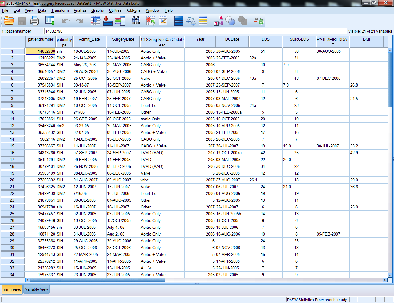
Too much information is contained in one variable (CTSSurgTypeCatCodeDesc, LOS, SURGLOS, DCDate, etc.)
Errors can easily be found by sorting (errors in Year, AGE)
The same content is entered in differently for a single variable (SEX, HTN, SMOKING)
Anything else?
5.2.2 Exercise 2
Open exercise2_data.sav (an Excel file). Modify this Excel file such that it can be imported into SPSS properly. Save the file and close it.
Open the file in SPSS (import it). Export this file back into Excel, but only save the following variables: id, salary, minority.
5.2.2.1 Exercise 2 Solution
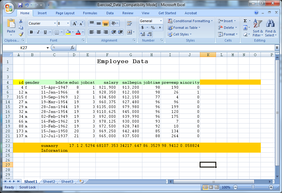
- Delete the first three rows of data (remove heading)
- Remove rows 23 and 24 (contains summary information)
- Remove the formatting (fill color)
- Save the file as Exercise2_Data_Ready
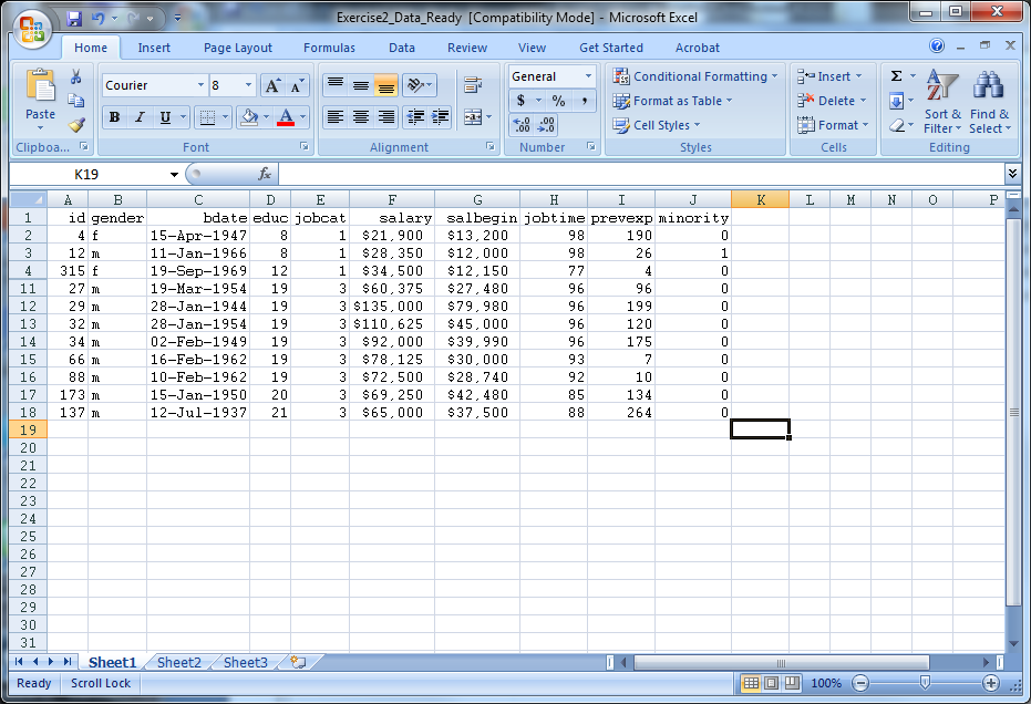
- Close Exercise2_Data_Ready
- Open SPSS
- Select File -> Open -> Data
- Under “Files of Type” select either “All Files” or “Excel” to view Exercise2_Data_Ready, select the file, then select “Open”
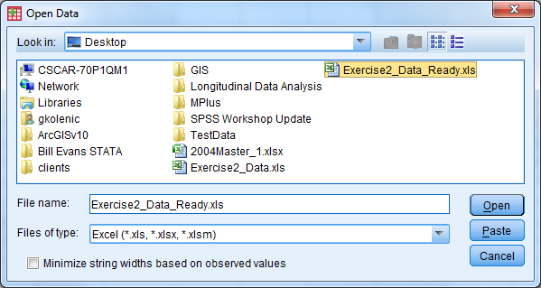
- A window appears
- Check the box so the variable names will be imported
- Select the sheet of the Excel file that you would like to be read in, then select “Ok”
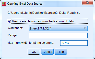
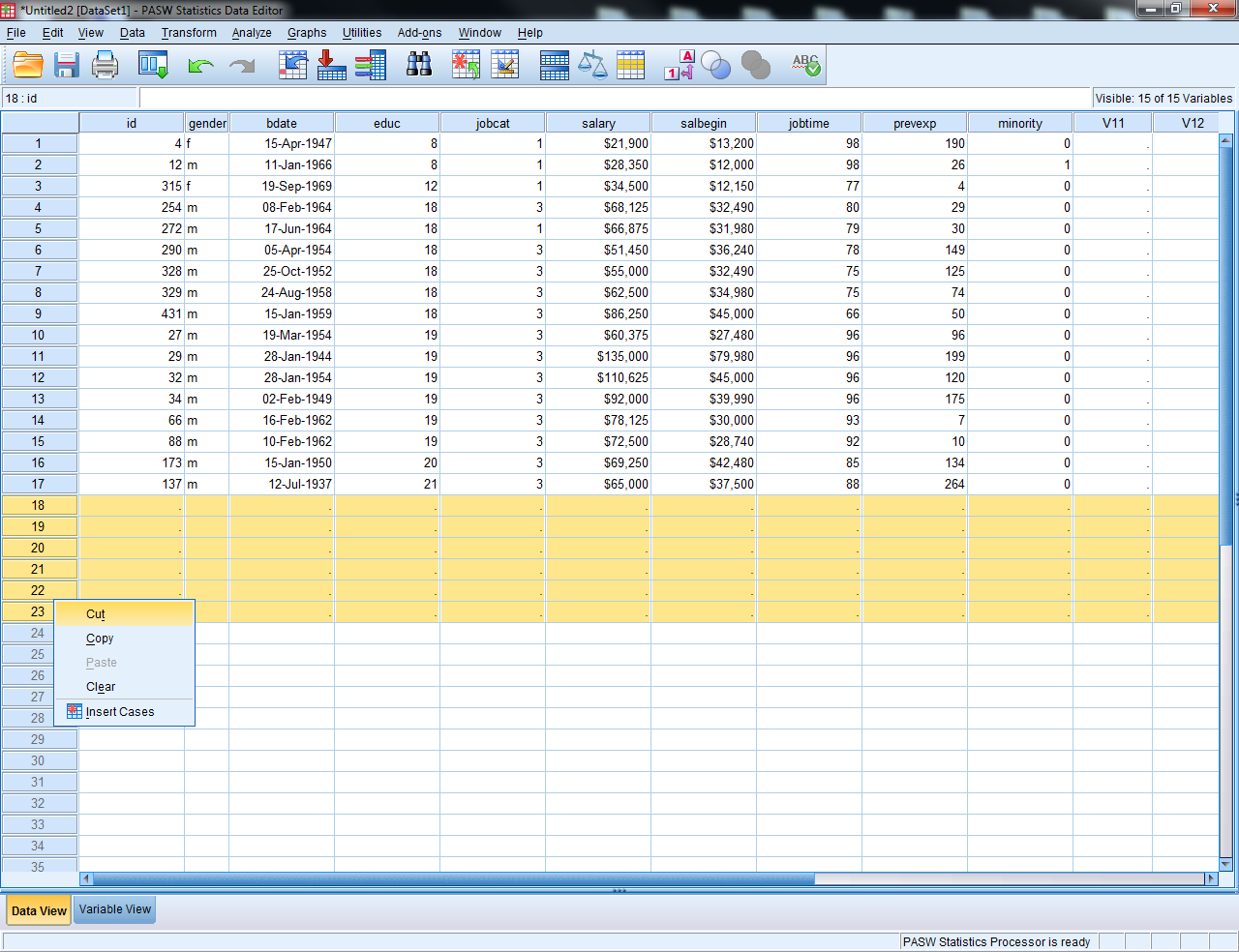
- The Excel data should now open in the Data Editor
- Delete any “blank” rows of data or columns of data (indicated by
.) by highlighting, right click, select “cut”
- Select File -> Save As
- Let the file name be Exercise2_Data_Ready_short
- Change the file type to Excel 97 through 2003 (*.xls)
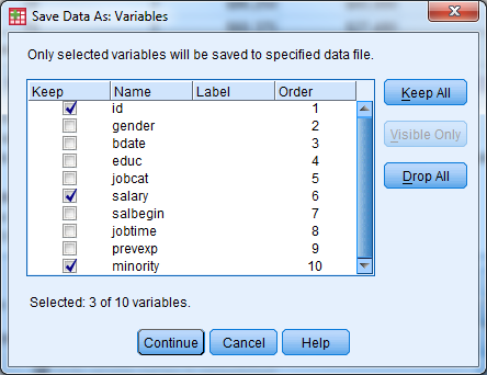
- Select the “Variables…” button
- Select the “Drop All” button
- Under the “Keep” column, check the box for id, salary, minority
- Select “Continue”
- Select “Save”
- Open the new file (Exercise2_Data_Ready_short) to investigate the results
5.2.3 Exercise 3
Open exercise3_data.sav and go to Variable View. Practice defining the correct attributes to each variable by following the code book.
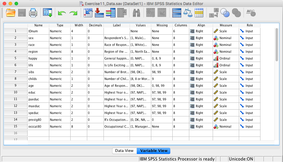
| Name | Label | Value Label | Missing Values | Measure |
|---|---|---|---|---|
| IDnum | Scale | |||
| sex | Respondent’s Sex | 1 = Male | Nominal | |
| 2 = Female | ||||
| race | Race of Respondent | 1 = White | Nominal | |
| 2 = Black | ||||
| 3 = Other | ||||
| region | Region of the United States | 1 = North East | Nominal | |
| 2 = South East | ||||
| 3 = West | ||||
| happy | General Happiness | 0 = NAP | 0, 8, 9 | Ordinal |
| 1 = Very Happy | ||||
| 2 = Pretty Happy | ||||
| 3 = Not too Happy | ||||
| 8 = DK | ||||
| 9 = NA | ||||
| life | Is Life Exciting or Dull | 0 = NAP | 0, 8, 9 | Ordinal |
| 1 = Exciting | ||||
| 2 = Routine | ||||
| 3 = Dull | ||||
| 8 = DK | ||||
| 9 = NA | ||||
| sibs | Number of Brothers and Sisters | 98 = DK | 98, 99 | Scale |
| 99 = NA | ||||
| childs | Number of Children | 8 = Eight or More | 9 | Scale |
| 9 = NA | ||||
| age | Age of Respondent | 98 = DK | 0, 98, 99 | Scale |
| 99 = NA | ||||
| educ | Highest Year of School Completed | 97 = NAP | 97, 98, 99 | Scale |
| 98 = DK | ||||
| 99 = NA | ||||
| paeduc | Highest Year School, Father | 97 = NAP | 97, 98, 99 | Scale |
| 98 = DK | ||||
| 99 = NA | ||||
| maeduc | Highest Year School, Mother | 97 = NAP | 97, 98, 99 | Scale |
| 98 = DK | ||||
| 99 = NA | ||||
| seeduc | Highest Year School, Spouse | 97 = NAP | 97, 98, 99 | Scale |
| 98 = DK | ||||
| 99 = NA | ||||
| prestg80 | Occupational Prestige Score | 0 = DK,NA,NAP | 0 | Scale |
| occcat80 | Occupational Category | 1 = Managerial and Professional | Nominal | |
| 2 = Technical and Sales | ||||
| 3 = Service | ||||
| 4 = Farming, Forest, and Fishing | ||||
| 5 = Production and Craft | ||||
| 6 = General Labor |
5.2.3.1 Exercise 3 Solution
- In Variable View, the first four columns do not need to be modified
- To modify the variable label, click in the cell that you wish to edit and start tying in the label
- To modify the value labels, click the cell that you wish to edit and then select the box with three small dots. The following window will appear:
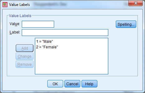
- Enter the value and label, then select “Add”. Once all possible value labels are added, select “OK”
- When value labels (or other attributes such as label or missing) repeat for a variable, you can copy and paste the attribute values. Right click on the cell you want to copy, select copy. Then right click on the cell that you would like to paste in, and select paste.
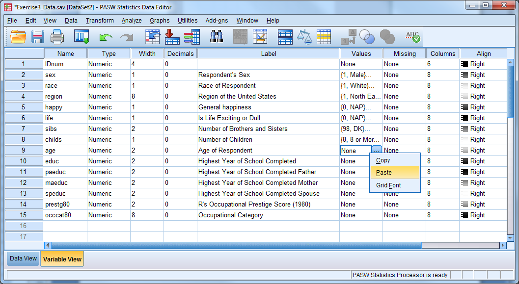
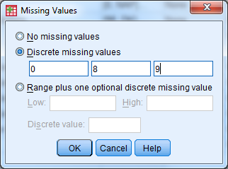
- Enter in missing values in a similar fashion—here we have discrete missing values
- Use the drop down menu for “Measure” to specify the correct measurement type
5.2.4 Exercise 4
Open exercise4_data.sav.
Compute a new variable that is the change from beginning salary to current salary for each employee.
Recode the education variable into a new variable according to the following
- 1=High School or Less (educ<=12)
- 2=Some College (12<educ<=16)
- 3=Bachelor’s Degree or Higher (educ>=17)
5.2.4.1 Exercise 4 Solution
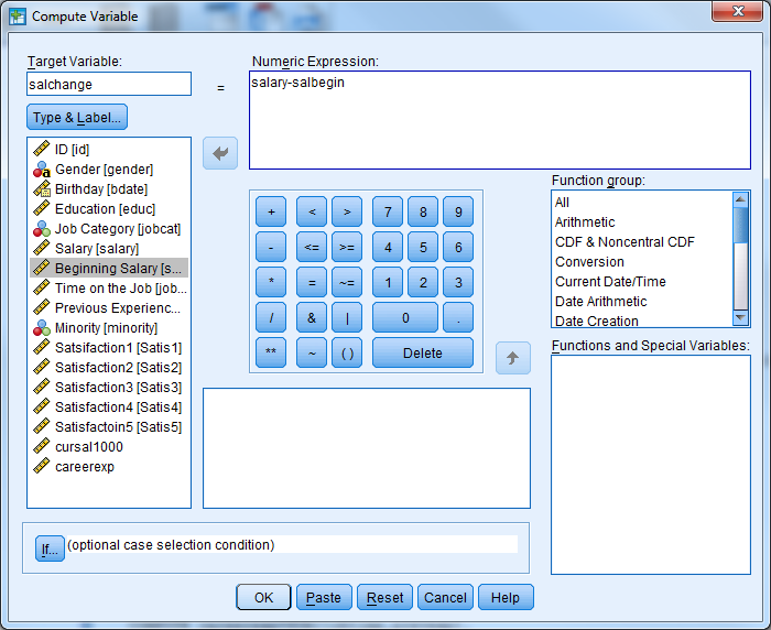
Compute a new variable that is the change from beginning salary to current salary for each employee.
- Transform -> Compute Variable
- Select “Reset”
- Enter the following information
- Target Variable: salchange
- Double click (or use the arrow) to move salary to the Numeric Expression window
- Use the calculator box below the numeric expression box to enter a minus sign (alternatively, you could type a minus sign) then select salbegin
- Select OK, and the new variable will appear in the data set
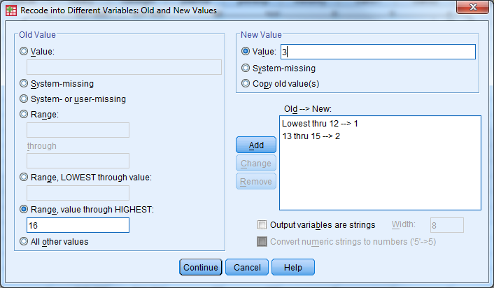
Recode the education variable into a new variable according to the following
- 1=High School or Less (educ<=12)
- 2=Some College (12<educ<=16)
- 3=Bachelor’s Degree or Higher (educ>=17)
- Transform -> Recode into different variables
- Move education (educ) into the Input Variable Output Variable window by double clicking on it or using the arrow
- Name: EducRecode
- Label: Leave Blank
- Click the change button
- Under old value, select the radio dial for Range, LOWEST through value: enter 12
- Under new value, select the radio dial for Value: enter 1
- Select Add
- Under old value, select the radio dial for Range: enter 13 through 15
- Under new value, select the radio dial for Value: enter 2
- Select Add
- Under old value, select the radio dial for Range, value through HIGHEST: enter 16
- Under new value, select the radio dial for Value: enter 3
- Select Add
- Select Continue
- Select OK
- Check the dataset in Data View
5.2.5 Exercise 5
Open exercise5_data.sav.
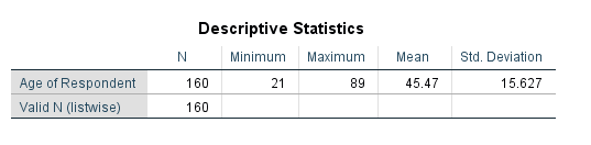
Select male managers. What is their average age?
(You can obtain the average age by choosing Analyze -> Descriptive Statistics -> Descriptives and moving “Age of Respondent (age)” to the right hand side.)
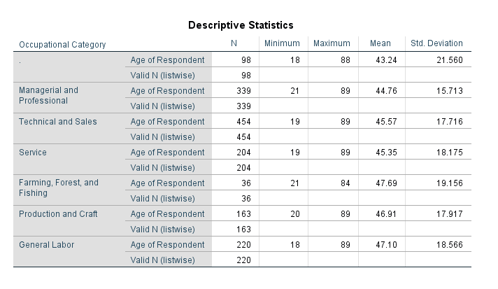
Use the “Split File” procedure to get the average age for each job category.
5.2.5.1 Exercise 5 Solution
Select male managers. What is their average age?
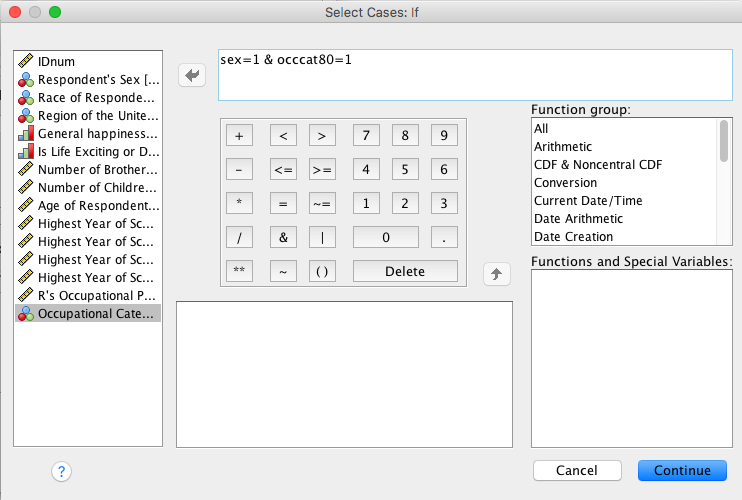
- Check Values for sex and occat80 to see what values correspond to “male” and “manager” (it’s 1 and 1).
- Data -> Select Cases
- Under Select: Select the If Condition is Satisfied radio dial and select the If button
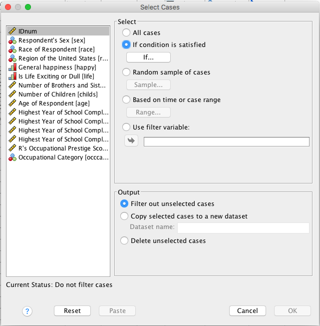
- Enter the following information
- Open box should read as follows: sex=1 & occcat80=1
- Continue
- Under Output: Select Filter Out Unselected Cases
- Select OK
- Inspect the data in Data View
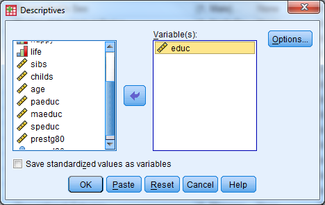
- Analyze -> Descriptive Statistics -> Descriptives
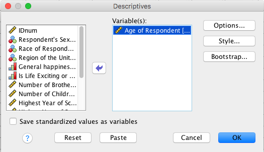
- Select the age variable, select OK
- Turn off the filter!
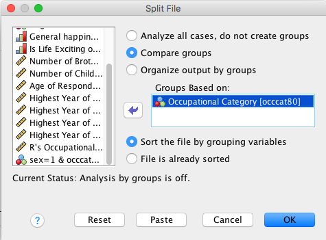
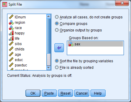
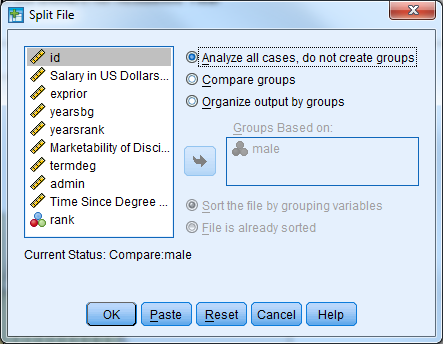
Use the “Split File” procedure to get the average age for each job category.
- Data -> Split File
- Select Compare Groups
- Select occat80 (Occupational Category) and move it into the Groups Based On window by double clicking (or using the arrow)
- Select Sort the File by Grouping Variables
- Select Ok
- Analyze -> Descriptive Statistics -> Descriptives
- Select the age variable and OK
- Turn off the split file!
5.2.6 Exercise 6
Convert exercise6_data from “Wide” format to “Long” format
5.2.6.1 Exercise 6 Solution
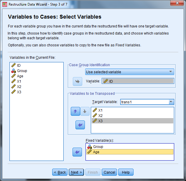
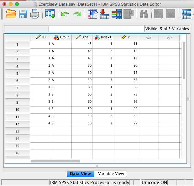
- Open exercise6_data.sav
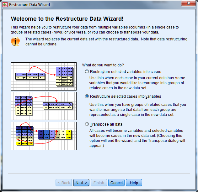
- Select Data -> Restructure to open the Wizard
- Select “Restructure selected variables into cases” then “Next”
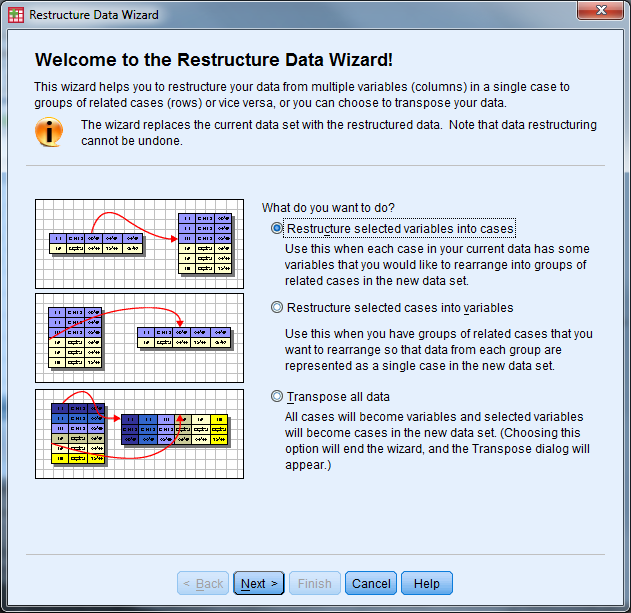
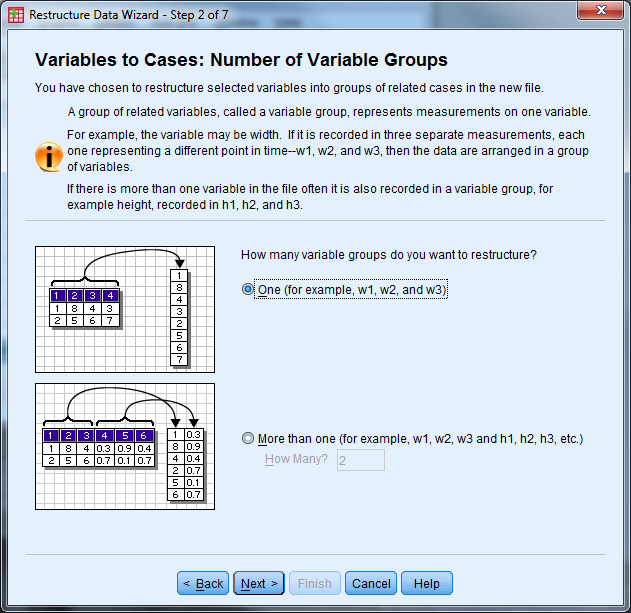
- How many variable groups to you want to restructure? Select “One” then “Next”
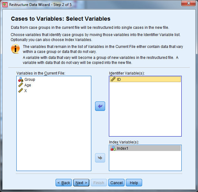
- Case Group Identification should be changed to “Use selected variable” and the variable should be the ID variable
- Variables to be transposed: Move the X variables over (X1, X2, X3)
- Fixed Variable(s): Move Group and Age over
- Select “Next”
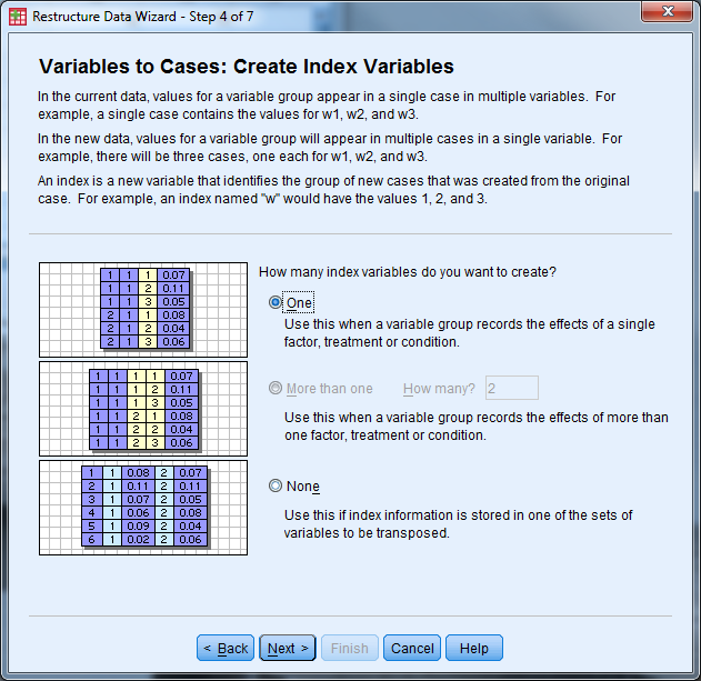
- How many index variables do you want to create? Select “one” then “Next”
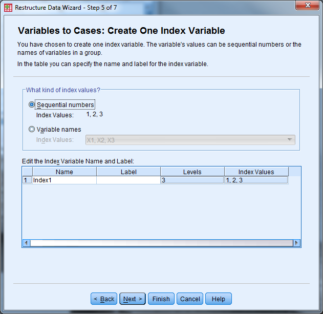
- What kind of index values? Select “Sequential Numbers” then select “Next”
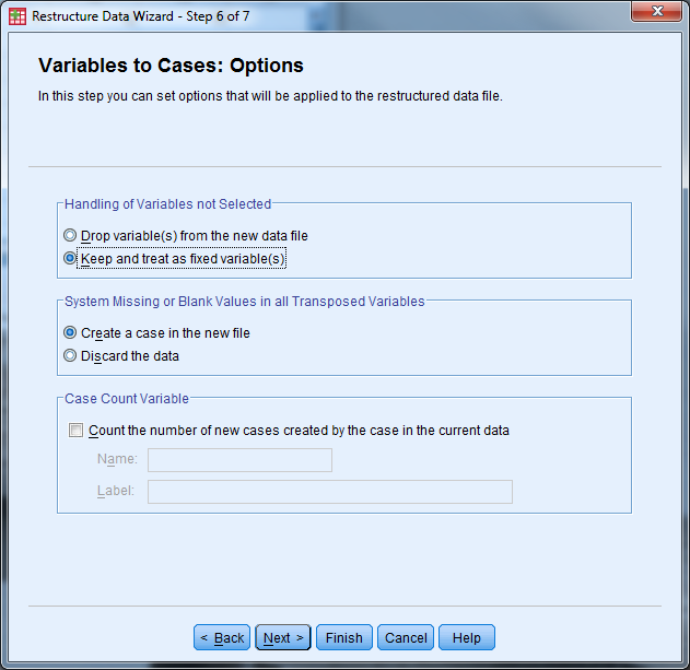
- Handling of Variables not Selected: Select “Keep and treat as fixed variable(s)”
- System Missing or Blank Values in All Transposed Variables: Select “Create a case in the new file”
- Leave “Case Count Variable” unchecked
- Select “Next”
- What do you want to do? Select “Restructure the data now”. In the future you may want to keep the syntax.
- Select “Finish”
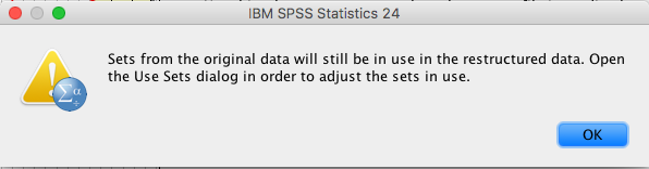
- The following message appears, click “OK”
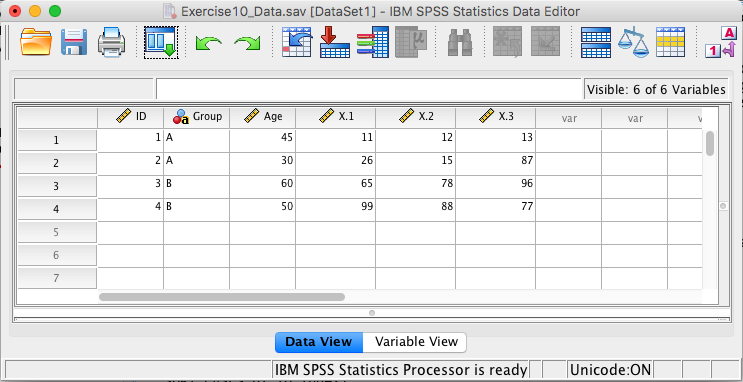
- Inspect the data (and change “trans1” to “X”)
5.2.7 Exercise 7
Convert exercise7_data from “Long” format to “Wide” format
5.2.7.1 Exercise 7 Solution
- Open exercise7_data.sav
- Select Data -> Restructure to open the Wizard
- Identifier Variable(s): ID
- Index Variable(s): Index1
- Select “Next”
- Sort the current data? Yes
- Select “Next”
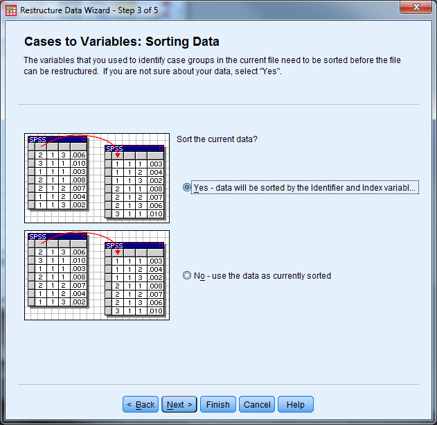
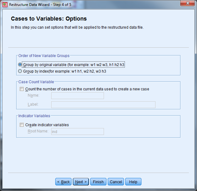
- Order of New Variable Groups: Group by original variable
- Leave the other options unchecked
- Select “Next”
- Select “Restructure the Data Now” and “Finish”
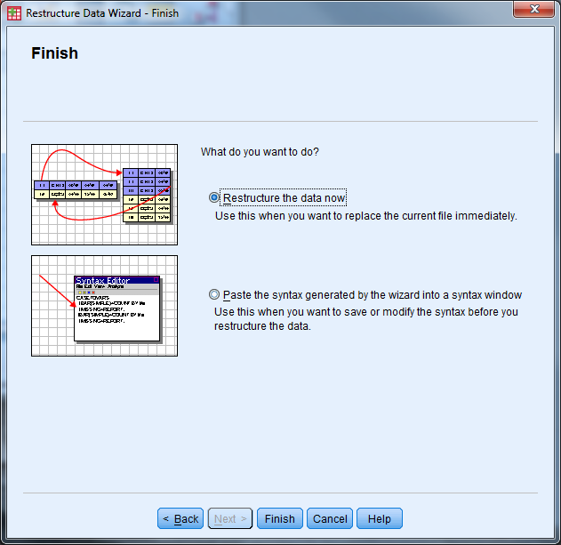
- The following message will appear, select “OK”. Inspect the data and save!
5.2.8 Exercise 8
Open exercise8_data.sav
Part 1: Investigate the variable attributes. Determine which variables are categorical variables (nominal and ordinal), and which variables are continuous (scale).
Obtain the appropriate descriptive statistics for each variable. Remember, continuous variables should be investigated with Descriptives and categorical variables should be investigated with frequency tables.
Hint: Select more than one variable in the Analyze -> Descriptive Statistics -> Descriptives”, or Analyze -> Descriptive Statistics -> Frequencies dialog boxes.
Part 2: Assess the distribution of the Occupational Prestige Score (“prestg80”) with both a histogram (normal curve displayed) and a Q-Q plot. Is the assumption that the population of Occupational Prestige Scores is normally distributed reasonable?
Part 3: Compare the average highest year of school completed (“educ”) for males and females.
Hint: First split the file by “sex” (Data -> Split File), then calculate the descriptive statistics. Be sure to return to the Split File menu when you are done with this question and return the dialog box to “Analyze all cases”.
Part 4: Produce a pie chart for the variable “region”. (We didn’t cover this, you can use either Chart Builder or Legacy Dialogs.)
5.2.8.1 Exercise 8 Solution
Open the dataset exercise8_data.sav
Part 1
Investigate the variable attributes. Determine which variables are categorical variables (nominal and ordinal), and which variables are continuous (scale).
- Select the “Variable View” tab
- Investigate the labels and measure of each variable
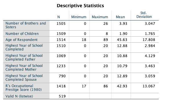
Obtain the appropriate descriptive statistics for each variable in the dataset. Remember, continuous variables should be investigated with 5-point summary descriptives and categorical variables should be investigated with frequency tables.
- Select Analyze -> Descriptive Statistics -> Descriptives
- Select the following variables: sibs, childs, age, educ, paeduc, maeduc, speduc, prestg80
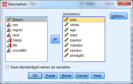
- Select “OK”
- Notice there are only 519 respondents that have valid data points for all of the continuous variables.
Frequency Tables:
- Select Analyze -> Descriptive Statistics -> Frequencies
- Select the following variables: sex, region, race, happy, life, occcat80
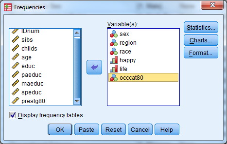
- Investigate the output
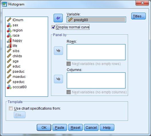
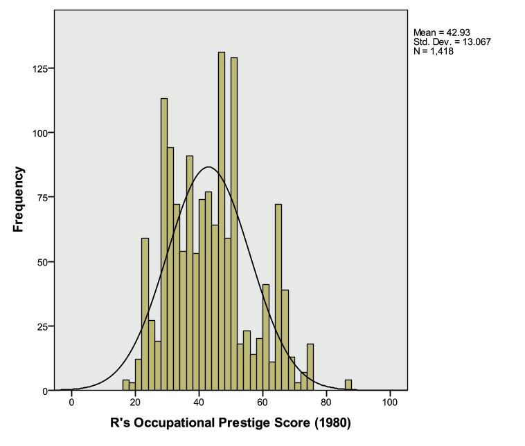
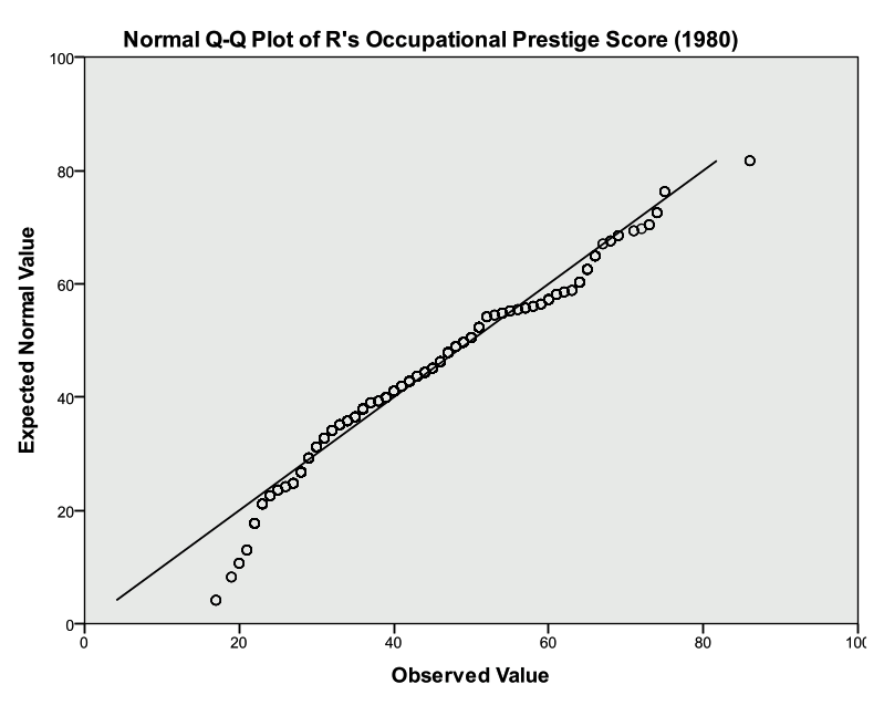
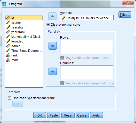
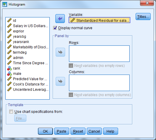
Part 2: Assess the distribution of the Occupational Prestige Score (“prestg80”) with both a histogram (normal curve displayed) and a Q-Q plot. Is the assumption that the population of Occupational Prestige Scores is normally distributed reasonable?
- Histogram in Legacy Dialogs
- Select Graphs -> Legacy Dialogs -> Histogram
- Variable: prestg80
- Check box to display normal curve
- Select OK
Investigate the output
- Q-Q Plot
- Select Analyze -> Descriptive Statistics -> Q-Q Plots
- Select the variable prestg80
- Select OK
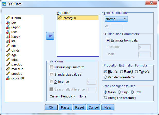
- Investigate the output
- Look to see how well the plotted points follow the solid diagonal line
- It is particularly important to pay attention to the “tails”, or the left most and right most points to see if they follow the line
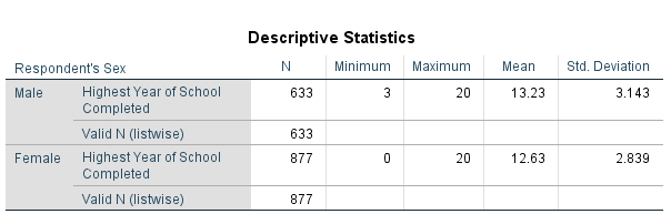
Part 3: Compare the average highest year of school completed (“educ”) for males and females.
- Set up the dataset such that the output is split by groups based on sex
- Select Data -> Split File
- Select “Compare Groups”
- Select the variable sex for “Groups Based on:”
- Select “OK”
- Compute the 5-Point Summary Descriptives for “educ”
- Select Analyze -> Descriptive Statistics -> Descriptives
- Select the variable “educ”
- Select “OK”
- Investigate the output
- Males have an average of 13.23 years of education
- Females have an average of 12.63 years of education
- Turn the split file feature off
- Select Data -> Split File
- Select “Analyze all cases, do not create groups” (Alternatively, “Reset” can be selected)
- Select “OK”
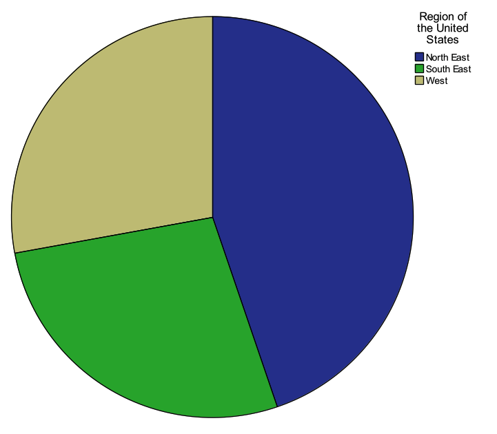
Part 4: Produce a pie chart for the variable “region”. Use “Legacy Dialogs”.
- Select Graphs -> Legacy Dialogs -> Pie
- Under “Data in Chart Are” select “Summaries for groups of cases”
- Select “Define”
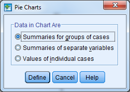
- Select the variable “region” for “Define Slices by:”
- The default for “Slices Represent” is “N of cases”, and leave this at the default
- Select “OK”
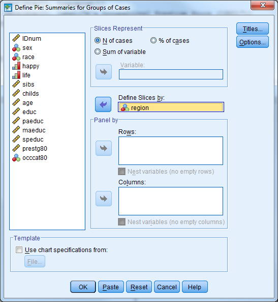
- Investigate the output
5.3 Additional Exercises
5.3.1 Exercise A1 – Categorical Data Analysis
Question 1
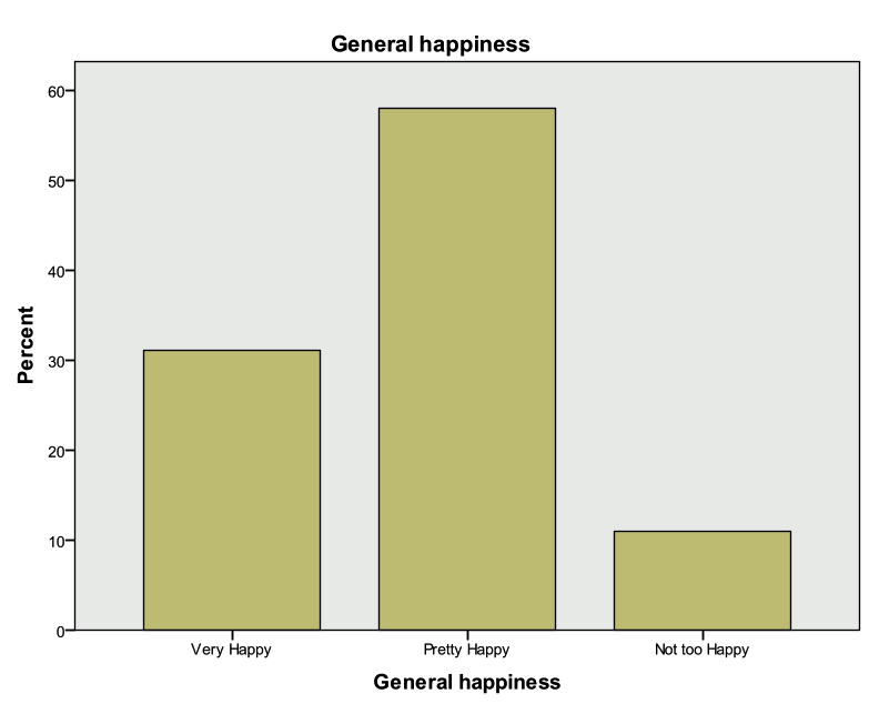
Open exercisea1_data. What percent of respondents said they were “Very Happy”? What about “Not too happy”? “Pretty happy”? Use a graph to display the variable.
Question 2
Do women appear to be more or less happy than men? Would you say this apparent relationship is statistically significant?
Question 3
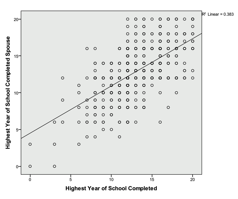
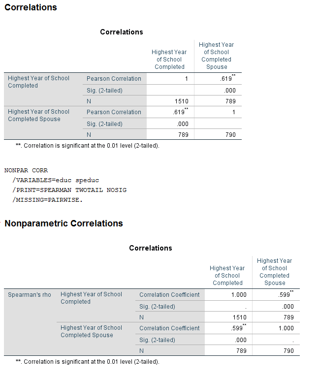
Create a scatter plot of respondent’s education vs. their spouses’ education. Does this relationship appear to be linear? Add a linear regression line to the plot. Inspect the correlation between the respondent’s education and their spouses’ education. Is this correlation positive or negative? Is it statistically significant.
5.3.2 Exercise A1 Solution
Question 1
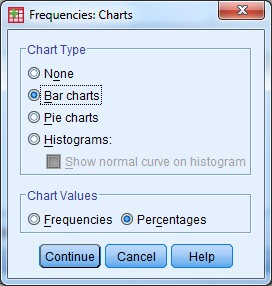
Open exercisea1_data. What percent of respondents said they were “Very Happy”? What about “Not too happy”? “Pretty happy”? Use a graph to display the variable.
Solution:
- We have one categorical variable that we would like to investigate…check the all on one page handout!
- Analyze -> Descriptive Statistics -> Frequencies
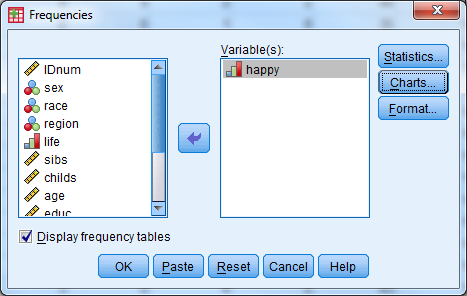
- Enter the following information
- Select happy
- Select Charts
- Under Chart Type, select Bar Chart
- Under Chart Values, select Percentages
- Select Continue
- Select the box for Display Frequency Tables
- Select OK

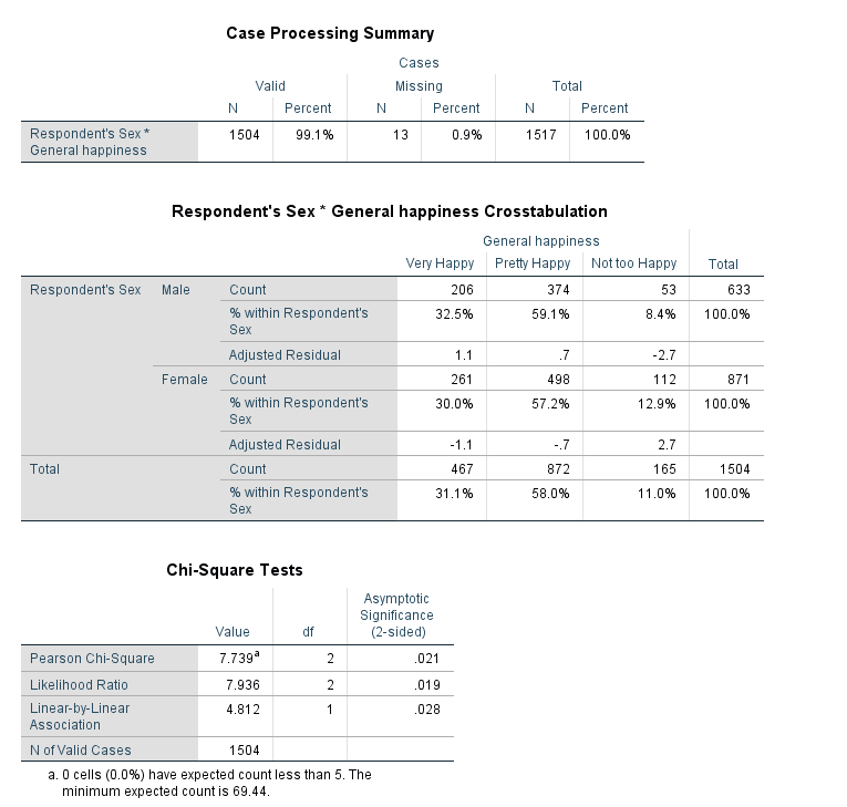
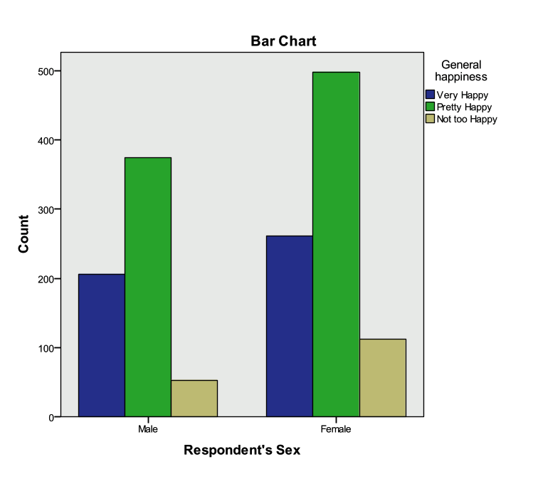
Question 2
Do women appear to be more or less happy than men? Would you say this apparent relationship is statistically significant?
Solution:
- We are going to compare two categorical variables. From out handout, we will use Pearson Chi-Square crosstabs to do this!
- Analyze -> Descriptive Statistics -> Crosstabs
- Enter the following information
- Rows: sex
- Columns: happy
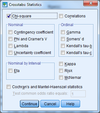
- Select the Statistics button
- Check the box for Chi-Square
- Select Continue
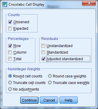
- Select the Cells button
- Check the box for Row under Percentages (leave the rest as default)
- Check the box for Adjusted Standardized Residuals under Residuals (leave the rest as default)
- Select Continue
- Select the box for Display Clustered Bar Charts
- Select OK
- The Pearson Chi-Square statistic indicates that the differences between men and women are statistically significant (pvalue/asymptotic significance<.05).
- The residuals, clustered bar chart, and row percentages can tell us where these differences arise
- An adjusted standardized residual (absolute value) greater than two shows us where the differences between groups occur. Here, we see that “not too happy” for males and females has a residual greater than 2.
- The row proportions indicate that there is a higher proportion of females that responded “not too happy” when compared to males.
- The clustered bar chart also shows that there are greater numbers of women that indicate that they are “not too happy”.
Question 3
Create a scatter plot of respondent’s education vs. their spouses’ education. Does this relationship appear to be linear? Add a linear regression line to the plot. Inspect the correlation between the respondent’s education and their spouses’ education. Is this correlation positive or negative? Is it statistically significant.
Solution:
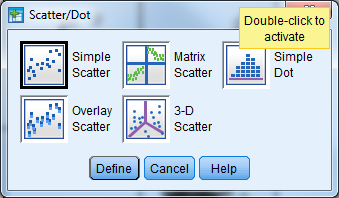
- Graphs -> Legacy Dialogues -> Scatter/Dot
- Simple Scatter and Define
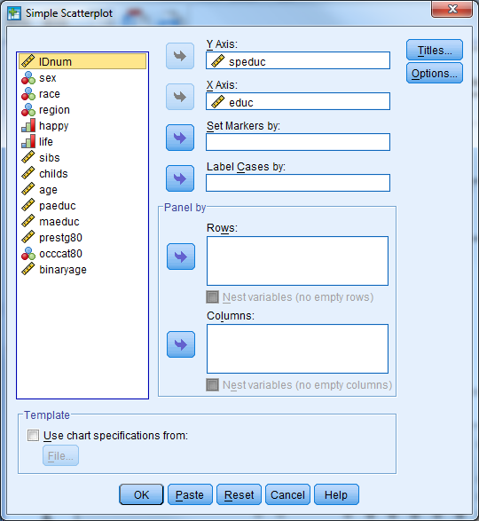
- Enter the following information
- Y Axis: speduc
- X Axis: educ
- Select OK
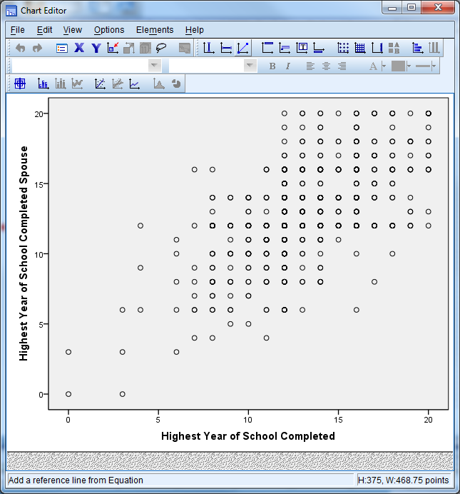
- Check the output for the scatter plot
- Double click the plot in the Output Viewer to open Chart Editor
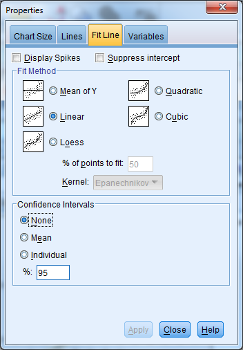
- Select the button for Add Fit Line at Total (first bar above the plot, axis with straight line plot)
- Select Linear Fit, Apply, Close
- Close out of chart editor (red X in the upper right corner) and the updated chart will appear in the Output Viewer.
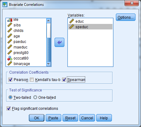
- Analyze -> Correlate -> Bivariate
- Enter the following information
- Variables: educ, speduc
- Correlation coefficients: Pearson, Spearman
- Significance: Two Tailed
- Check the box for Flag significant correlations
- Select OK
- The output indicates that the correlation between education and spouses’ education is positive and statistically significant.
5.3.3 Exercise A2 – Continuous Data Analysis
Open exercisea2_data.sav.
Research Question 1: Is there a relationship between a student’s socio-economic status and whether or not the student would participate in a racially insensitive joke?
What techniques would you use to investigate the relationship between SES and whether or not a student would participate in a racially insensitive joke?
Investigate this relationship graphically and statistically. What did you find?
Research Question 2: Is there a relationship between a student’s race and their post intervention behavior intention scale?
What techniques would you use to investigate a student’s race and their post intervention behavior intention scale?
Investigate this relationship graphically and statistically. What did you find?
Research Question 3: Is there a relationship between the race of a student and their socio-economic status?
What techniques would you use to investigate the relationship between race and SES?
Investigate this relationship graphically and statistically. What did you find?
5.3.4 Exercise A2 Solution
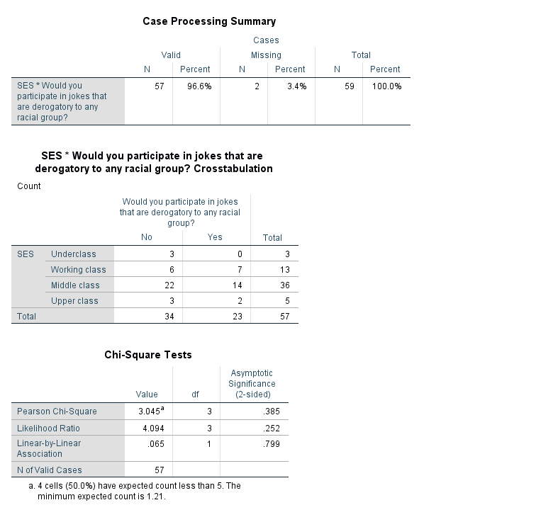
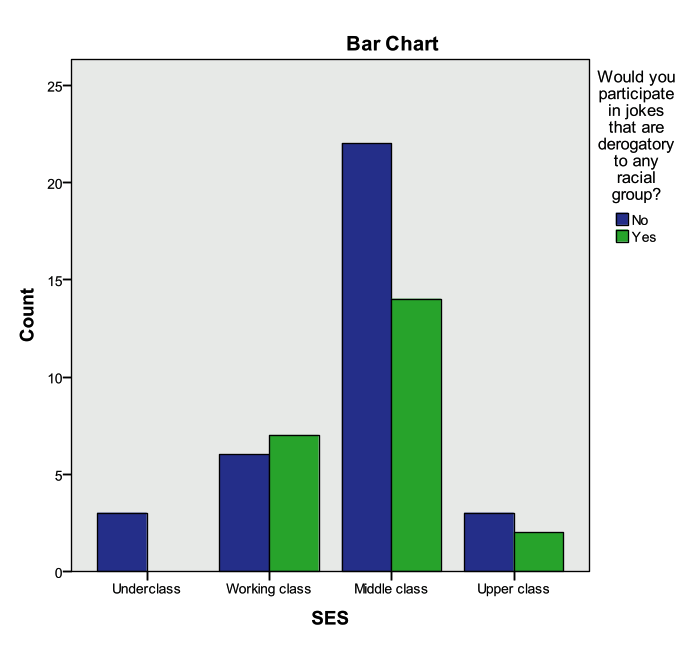
Research Question 1: Is there a relationship between a student’s socio-economic status and whether or not the student would participate in a racially insensitive joke?
What techniques would you use to investigate the relationship between SES and whether or not a student would participate in a racially insensitive joke?
ANSWER: SES is an ordinal variable with 4 levels that should be treated as a categorical variable. Whether or not a student would participate in a derogatory joke is measured with the “Joke” variable and it is a categorical variable. The appropriate statistical procedure to use to compare two categorical variables is the Chi-Square Test of Independence (crosstabs). The appropriate graphical procedure is a clustered bar chart.
Investigate this relationship graphically and statistically. What did you find?
ANSWER: There is not a statistically significant relationship between “SES” and “Joke”. We do not have enough evidence to say that there is a relationship between a student’s socio-economic status and whether or not the student would participate in a racially insensitive joke.
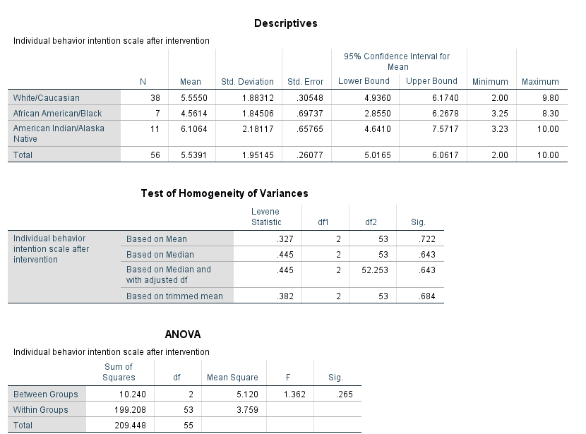
Research Question 2: Is there a relationship between a student’s race and their post intervention behavior intention scale? What techniques would you use to investigate a student’s race and their post intervention behavior intention scale?
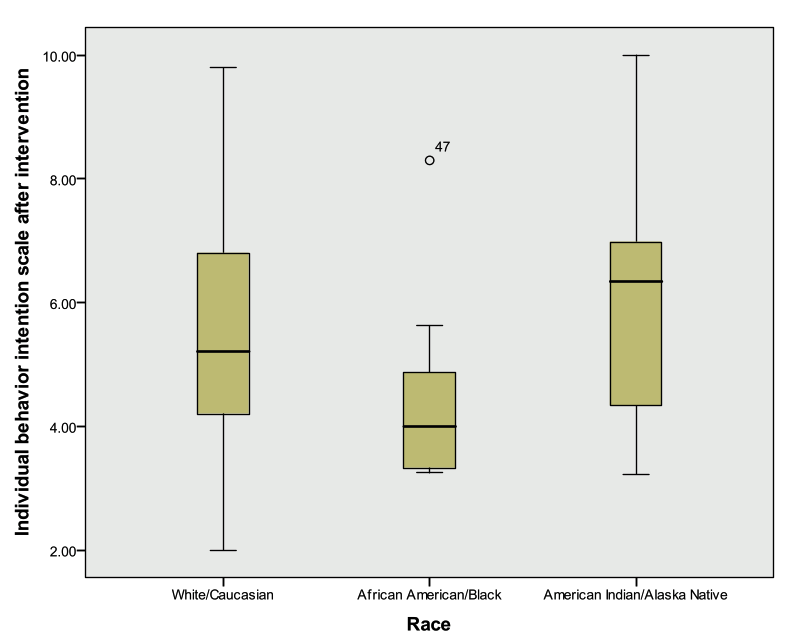
ANSWER: “Race” is a categorical variable that can take on up to 9 values and a student’s post intervention behavior intention scale (“BIndBehint_post”) is a continuous variable. The appropriate statistical procedure is a one-way ANOVA. The appropriate graphical procedure is a side-by-side box plot.
Investigate this relationship graphically and statistically. What did you find?
ANSWER: There is not a statistically significant relationship between “Race” and “BIndBehint_Post”. We do not have enough evidence to say that there is a relationship between a student’s race and their post intervention behavior intention score.
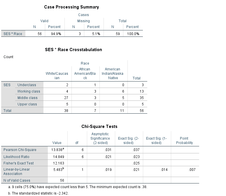
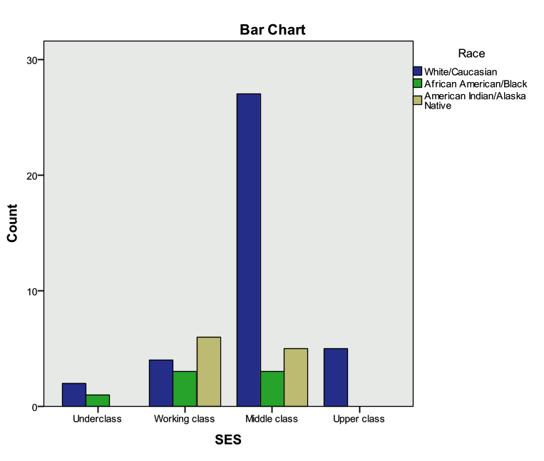
Research Question 3: Is there a relationship between the race of a student and their socio-economic status? What techniques would you use to investigate the relationship between race and SES?
ANSWER: “Race” and “SES” are both categorical predictors. The appropriate statistical procedure to use to compare two categorical variables is the Chi-Square Test of Independence (crosstabs). The appropriate graphical procedure is a clustered bar chart.
Investigate this relationship graphically and statistically. What did you find?
ANSWER: There is a statistically significant relationship between “Race” and “SES”. There is a significant relationship between a student’s SES and race. Notice the error message under the Chi-Square results table—in this case, we need to verify our statistically significant results with Fisher’s Exact Test (pvalue=.025).
5.3.5 Exercise A3 – Methodology Choice Practice
In the below questions first determine what the appropriate analysis method is based on the variables of interest and carry out these methods within SPSS.
A) From exercisea3_data_a.sav
- Is there a relationship between sex (gender) and job category (jobcat)?
- Is there a relationship between job category (jobcat) and minority status (minority)?
- Is there a relationship between job category (jobcat) and salary (salary)?
- Is there a relationship between experience (jobtime) and salary (salary)?
B) From exercisea3_data_b.sav
- Is there a relationship between general happiness (happy) and occupational prestige score (prestg80)?
- Is there a relationship between age (age) and occupational prestige score (prestg80)?
- Is there a relationship between general happiness (happy) and perception of life being exciting or dull (life)?
Exercise A3 Hints!
A)
- Two Categorical VariablesClustered Bar Charts, Pearson Chi-Square Crosstabs
- Two Categorical VariablesClustered Bar Charts, Pearson Chi-Square Crosstabs
- Categorical DV (3+Groups) & Continuous DVOne Way ANOVA, Side-by-Side Boxplot
- Two Continuous VariablesPearson Correlation Coefficient, Scatterplot
B)
- Categorical DV (3+Groups) & Continuous DVOne Way ANOVA, Side-by-Side Boxplot
- Two Continuous VariablesPearson Correlation Coefficient, Scatterplot
- Two Categorical VariablesClustered Bar Charts, Pearson Chi-Square Crosstabs
5.3.6 Exercise A4 – Case Study I: Salary (Regression)
Open exercisea4_data.
Background
This data set contains information on faculty from Bowling Green State University for the 1993 to 1994 (DeMaris 2004). The purpose of the exercises below is to investigate whether there was any evidence of gender inequality in faculty salaries at BGSU.
Activity 1: Describing the Dataset
Investigate the ‘Faculty’ data set using descriptive statistics, one variable graphing procedures, and bivariate procedures.
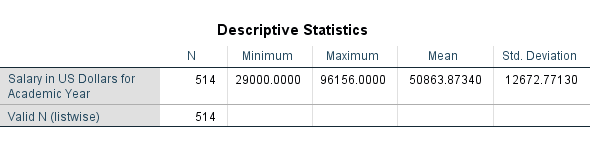
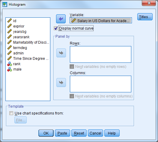
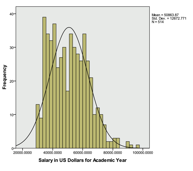
Investigate ‘Salary’ with descriptive statistics, box plot, and histogram
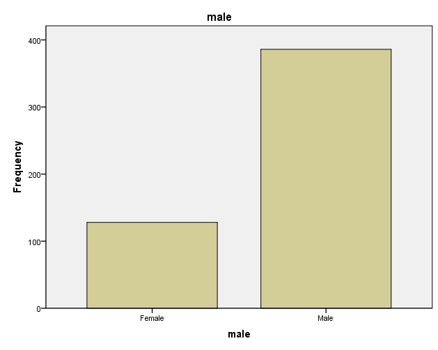
Investigate ‘Gender’ with a frequency table and bar chart
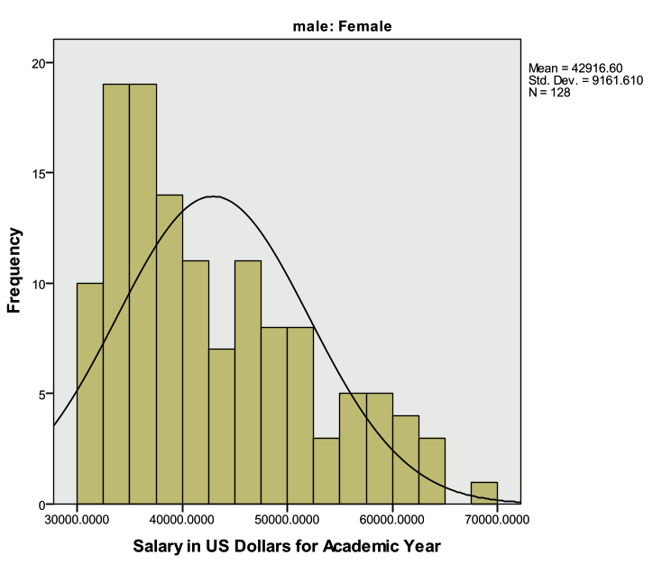
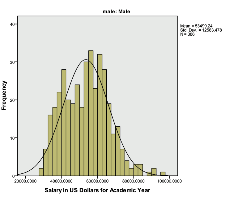
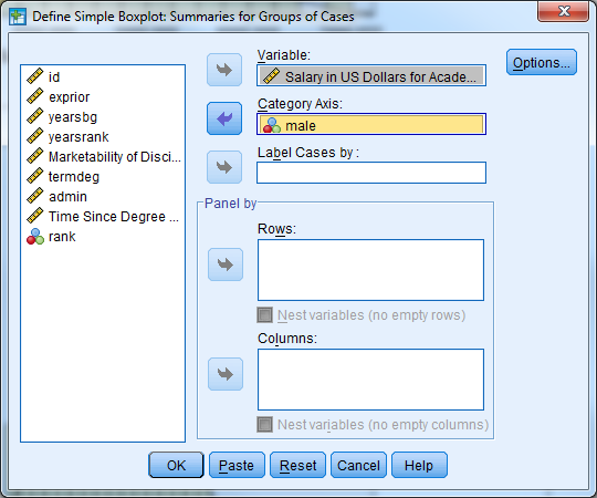
Investigate the average salary for males and females separately (descriptive statistics, histogram, side-by-side box plot)
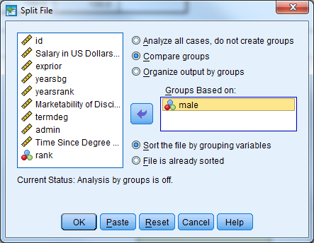
Remember to split the file by the gender variable (‘male’).
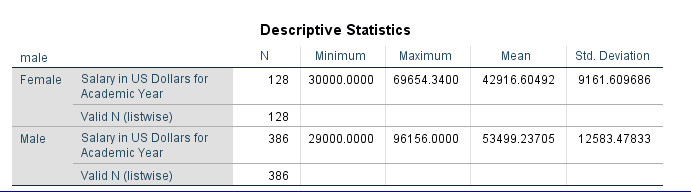
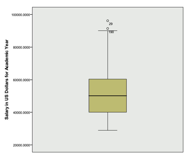
The descriptive statistics table above indicates that males earn more than females on average.
Also remember to remove the ‘Split File’ option.
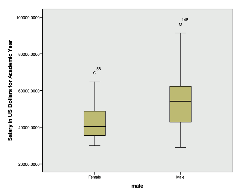
The Boxplot below indicates that males have a higher median salary than females, and both males and females have outliers (observation 148 and 58 respectively).
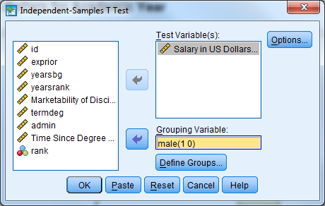
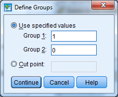
Perform an independent samples t-test
Remember that the dialogue box for the independent samples t-test is located under ‘Analyze’ then ‘Compare Means’.
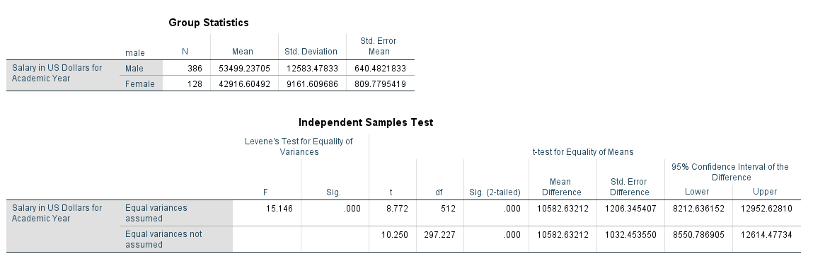
The table above indicates that we cannot assume equal variances between males and females (Levene’s Test pvalue<.05). Regardless, we see that the differences between average male and female salaries are large enough to be considered statistically significant (t=10.250, df=297.227, pvalue<.001). The confidence interval for the mean difference between genders is [8550.79, 12614.47]. This is the plausible range of values for the difference between males and females.
Activity 2: Simple Linear Regression
The independent samples t-test is one way to model the relationship between the faculty salary (dependent variable of interest) and gender (independent variable). Faculty salary may also be a function of the marketability of the discipline the faculty member is in.
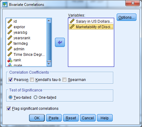
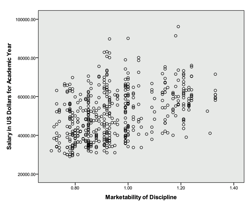
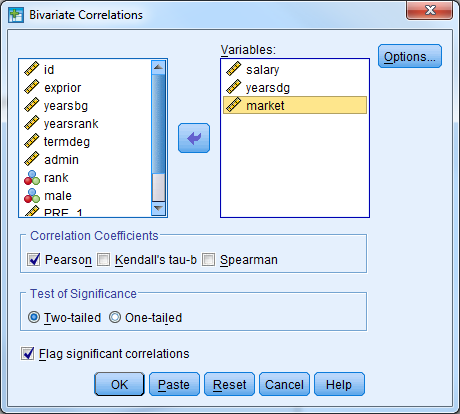
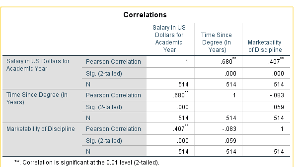
Investigate the correlation between ‘salary’ and ‘market’ and investigate a scatter plot of the two variables
In SPSS, select Analyze -> Correlate -> Bivariate
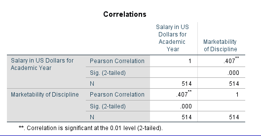
We see from the table above that there is a statistically significant correlation between faculty salary and marketability of the discipline (r=.407, pvalue<.001).
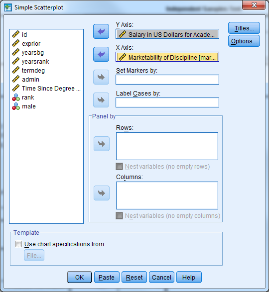
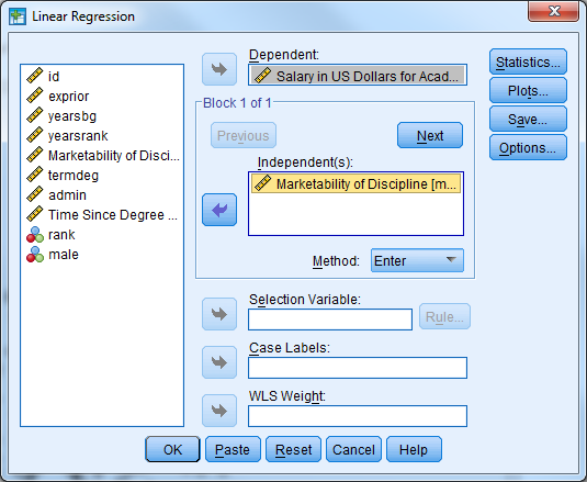
Perform a simple linear regression where ‘salary’ is the dependent/outcome variable and ‘market’ is the independent/predictor variable
This can be done multiple ways in SPSS. The first way uses the regression menu from ‘Analyze’ while the second uses the ‘General Linear Model’ menu.
Select Analyze -> Regression -> Linear
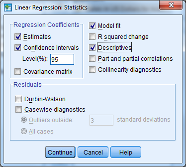
Notice that the regression menu provides the correlation between the variables included in the model.
The table below provides the R Square value and adjusted R Square value. The proportion of variance in faculty salary explained by marketability of discipline is 16.6%.
The table below indicates that the model fitted is significantly better than what we would expect by chance (F=101.771, pvalue<.001). The null hypothesis is that there is no linear relationship between faculty salary and marketability, and we reject this hypothesis.
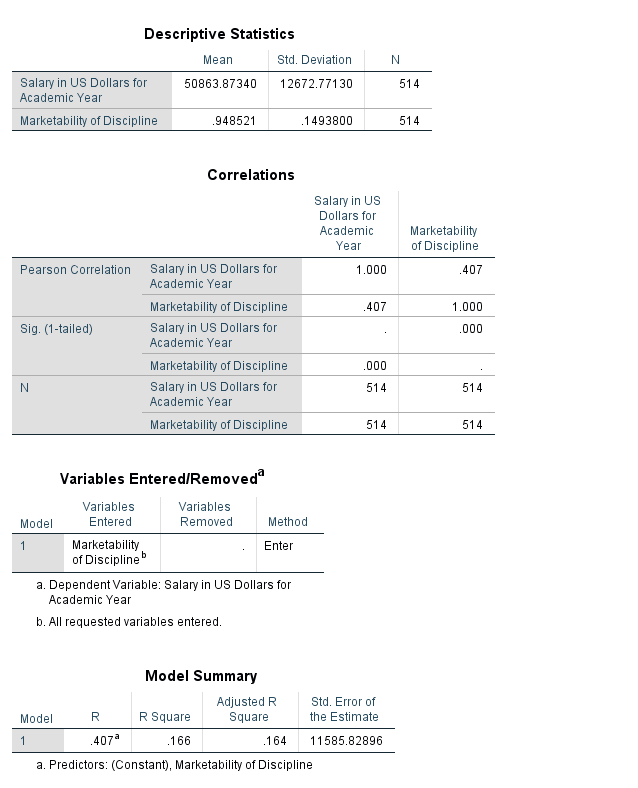
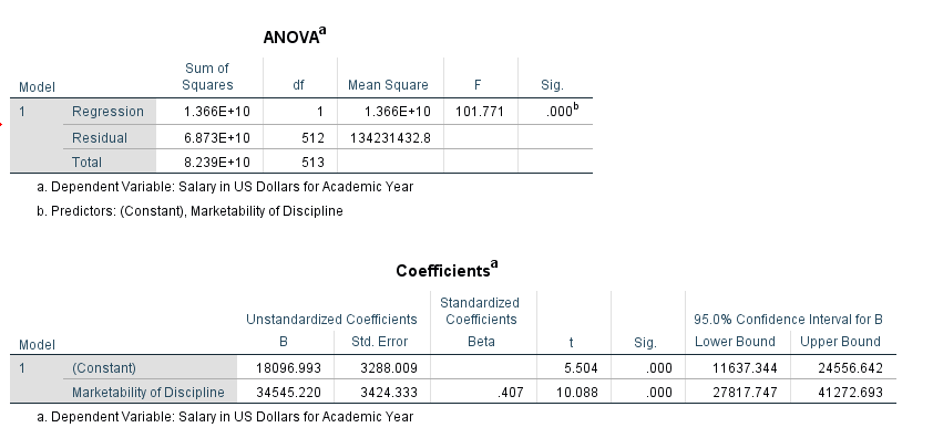
The table above provides the parameter estimates for our model. For every one unit increase in marketability, faculty salary increases by an average of $34,545. We could also interpret the beta coefficient for marketability the following way: the effect of a .1 point increase in marketability is associated with an estimated increase in mean salary of $3,454. The constant (intercept) for the model is interpreted as the estimated mean salary when marketability is equal to zero.
Remember that the confidence intervals give us a range of reasonable values for an estimate. The 95% confidence interval for our estimate of market discipline is [$27817, $41272].
The hypothesis tests provided with the ‘t’ statistic and ‘Sig.’ columns help us decide if a particular value (usually zero) is a reasonable estimate. If our estimated beta coefficient for market discipline was zero, then market discipline would not have an effect/relationship with faculty salary. This is our null hypothesis, and we would like to reject this hypothesis. Here we find a significant relationship between market discipline and faculty salary (t=10.088, pvalue<.001).
The second method for generating results for a simple linear regression is described below. Keep in mind that this method for performing a linear regression is preferred when there are categorical predictor/independent variables or interaction terms between independent variables.
Select Analyze -> General Linear Model -> Univariate
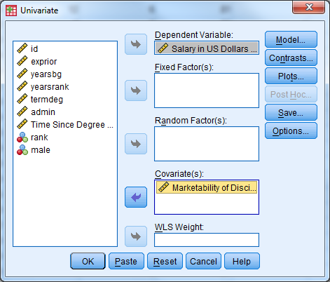
The table below provides the descriptive statistics for faculty salary.
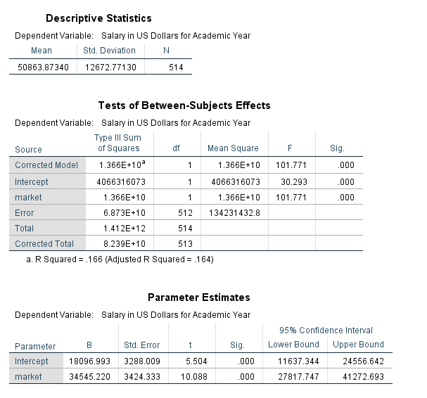
The table above indicates that the overall regression model is significant (F=101.771, pvalue<.001). This is indicated by the line for ‘Corrected Model’. The R Squared value is also listed in footnote a. for the table.
The parameter estimates table above provides the same information as the previous coefficients table.
Notice that the results are the same between the two methods that can be used in SPSS to perform a regression. For the remainder of the workshop we will use the second method to obtain our regression results (Analyze -> General Linear Model -> Univariate).
Activity 3: Simple Linear Regression Diagnostics
Perform the necessary regression diagnostics for the regression from exercise 2.
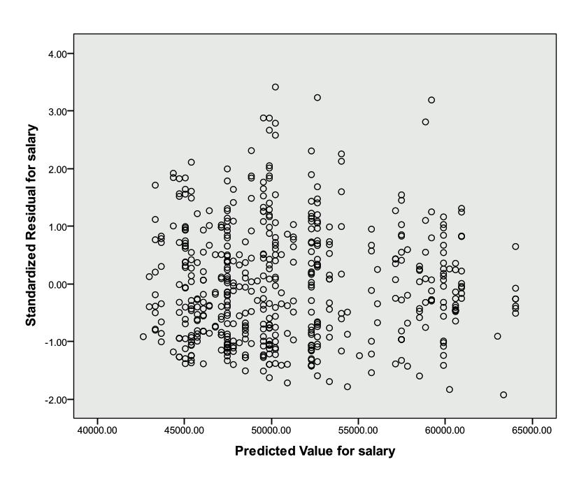
Check the linearity and homogeneity of variance assumptions
Plot the residuals against the predicted values from the model. The residuals should be randomly scattered around zero, and the variability should be constant in the plot.
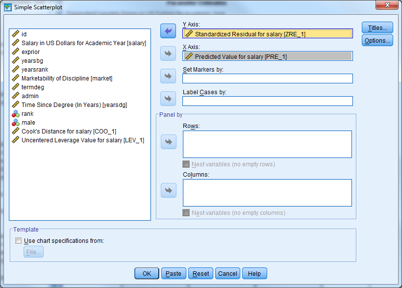
The scatter plot below does not indicate that either assumption has been violated.
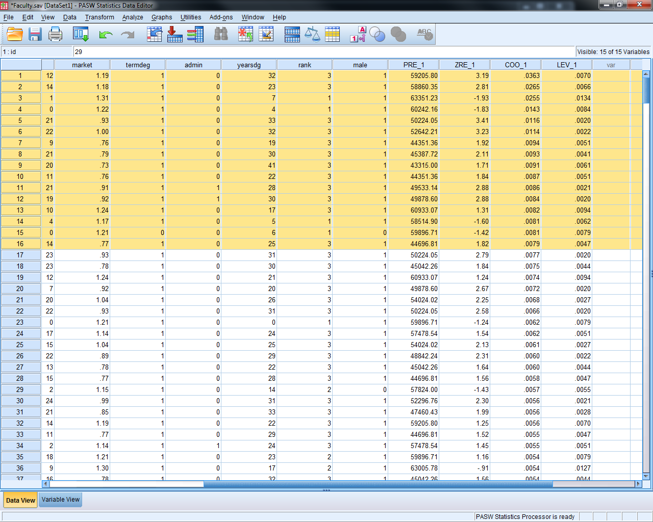
Check for influential points
The scatter plot from exercise 2 did not indicate that there were points of interest.
A leverage point is an unusual point that has the potential to influence the fit of the model. Sort the data set by Leverage in descending order. A rule of thumb is a point is considered to have large leverage when the leverage value is greater than 2p/n where p equals the number of parameters in the model. Here we estimate the intercept and slope for market, so p=2. This means that high leverage values are greater than 2*2/514=4/514=.0078. There are 53 points with high leverage.
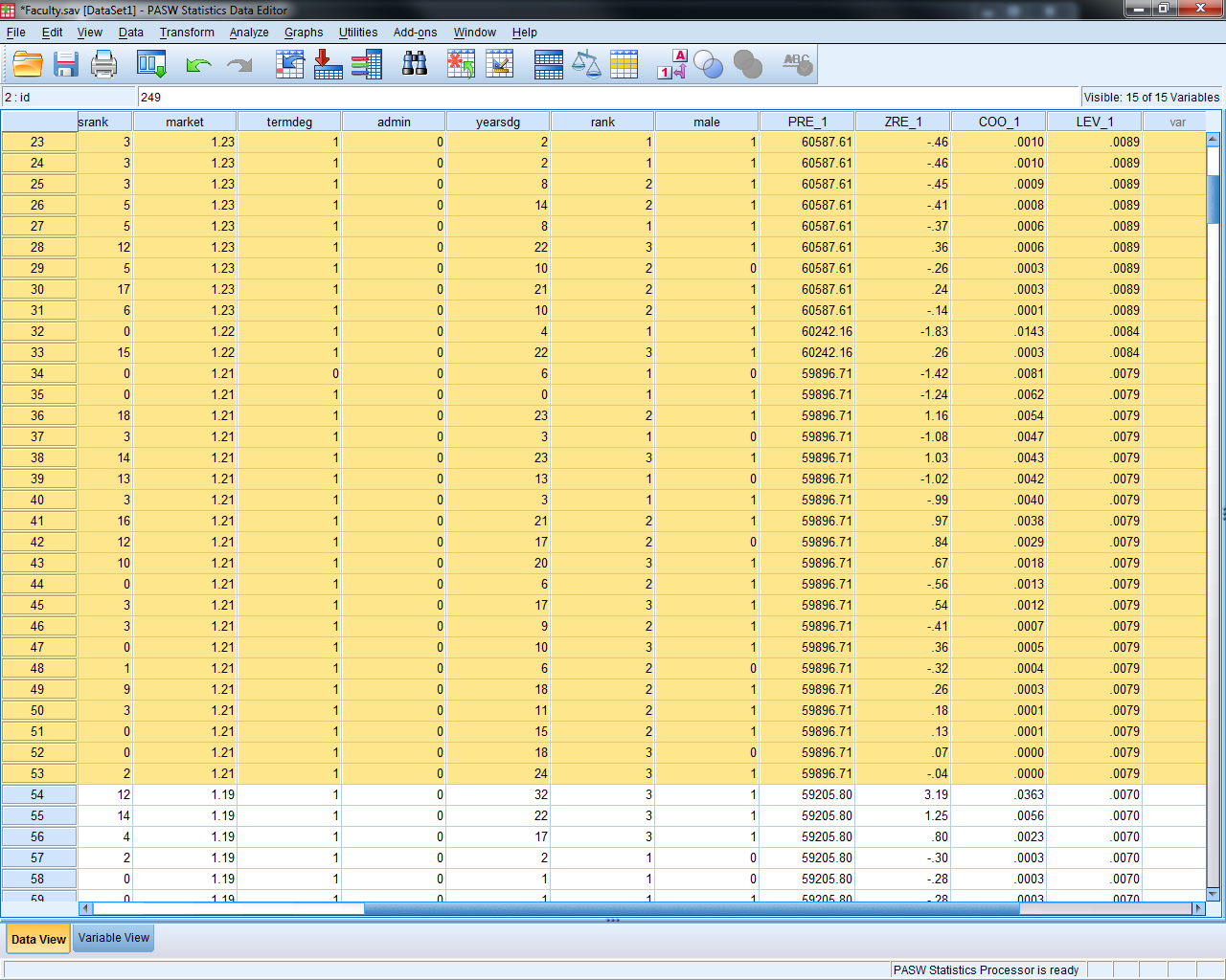
An influential point is one whose removal from the dataset would cause a large change in the fit of the regression model. An influential point may or may not be an outlier. Also, and influential point may or may not have large leverage. Usually an influential point will be an outlier and or may have large leverage. Sort the data set by the Cook’s distance variable in descending order. This will list the observations with the largest Cook’s distance first. Remember a distance greater than 1 or 4/n=4/514=.0078 is considered large. The first 16 observations have large Cook’s distances, but we do not have cause to remove them from the data set.
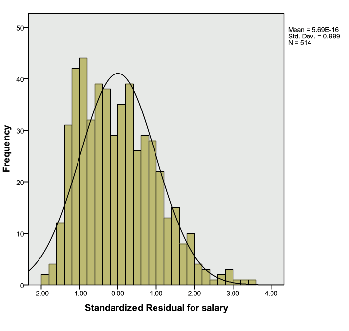
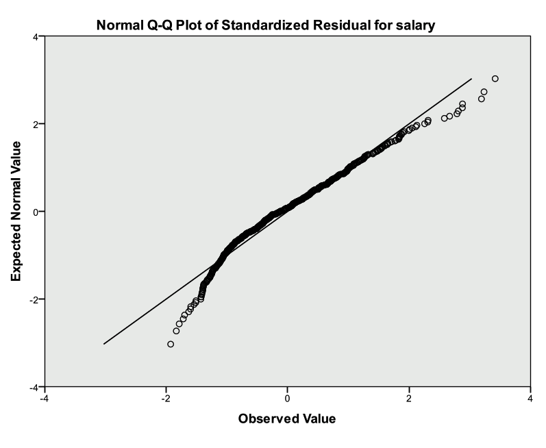
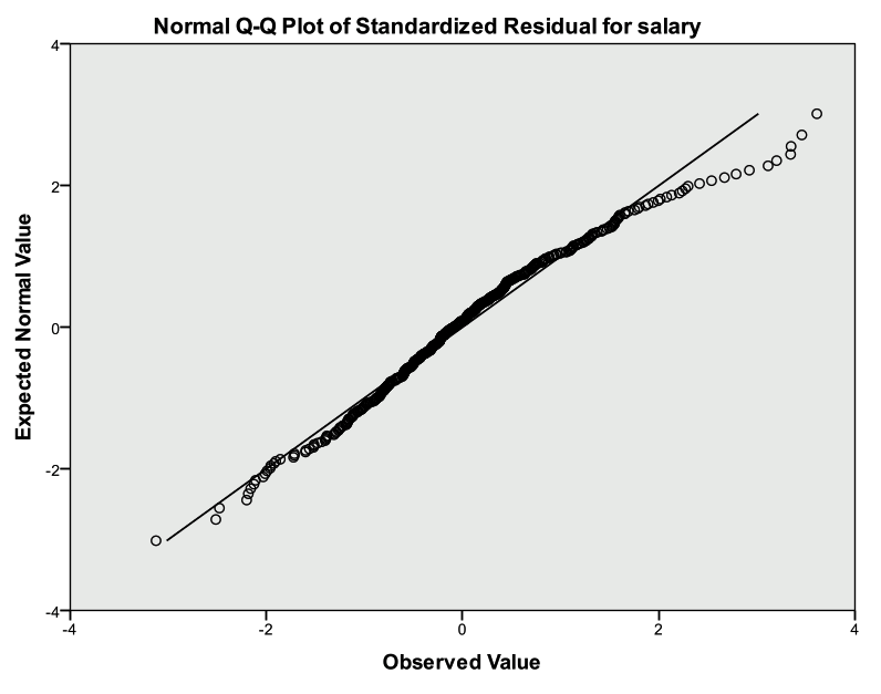
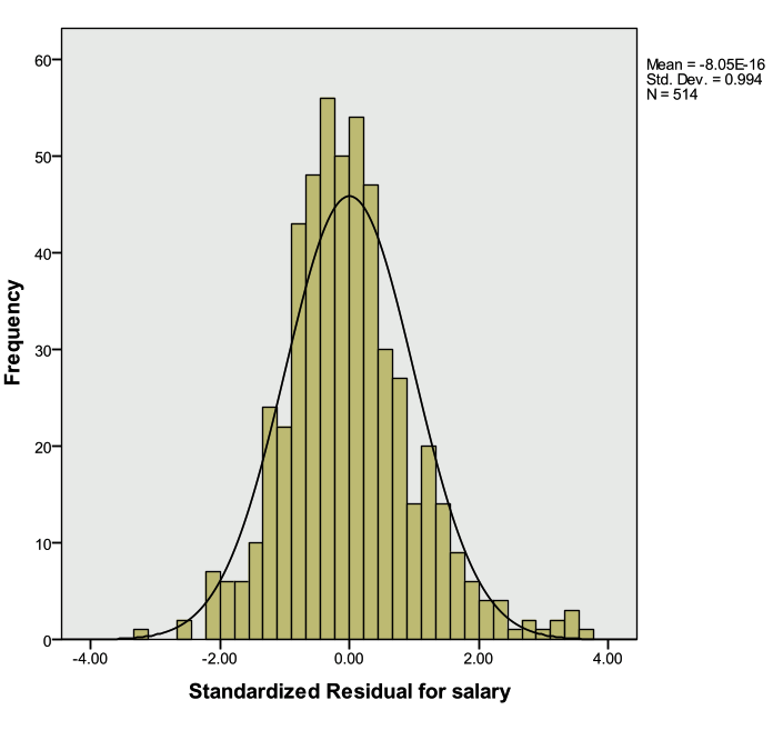
Check the normality assumption for the residuals
The plot below indicates that the normality assumption is reasonable.
A QQ-plot can also be investigated (Analyze -> Descriptive Statistics -> QQ Plot)
Activity 4: Multiple Regression with a Categorical Predictor
Faculty salary appears to be a function of the marketability of the discipline the faculty member is in, but it also may be a function of gender.
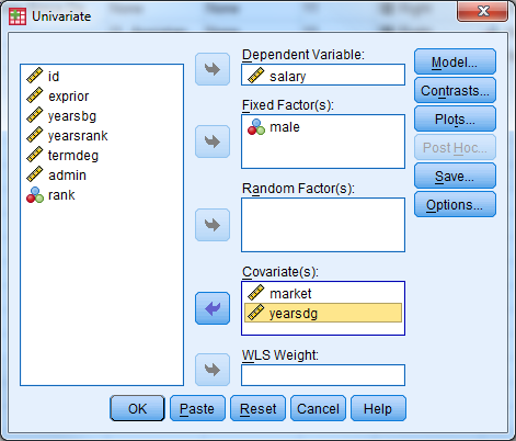
Create a multiple regression model where salary is the dependent variable, and both marketability and gender are the predictors.
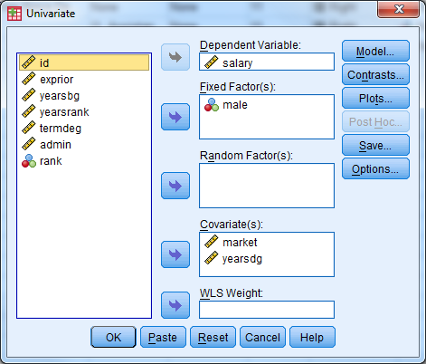
Select Analyze -> General Linear Model -> Univariate
Select ‘salary’ as the dependent variable, male as the fixed factor, and market as the covariate. Remember that any categorical predictor in a basic regression model should be entered in as a ‘fixed factor’, while any continuous prediction is considered a ‘covariate’.
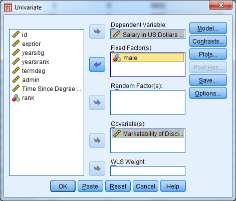
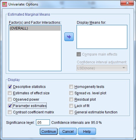
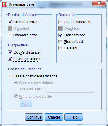
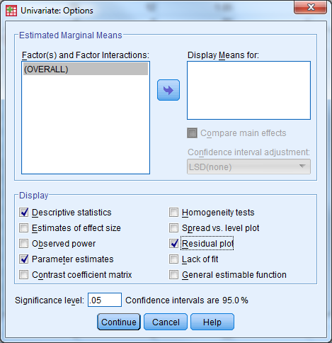
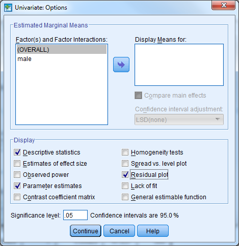
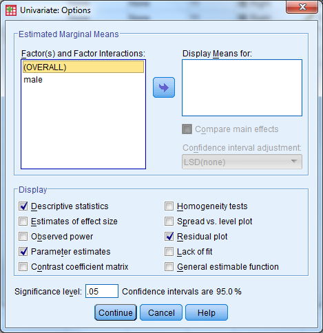
Under ‘Options’, select ‘Descriptive Statistics’, ‘Parameter Estimates’, ‘Residual Plot’
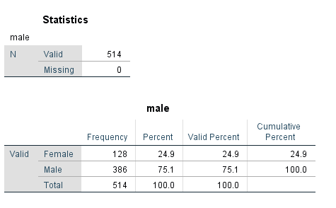
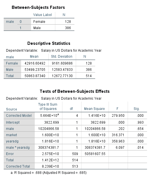
The table below indicates the number of Males and Females in the data set, along with the code that denotes the genders.
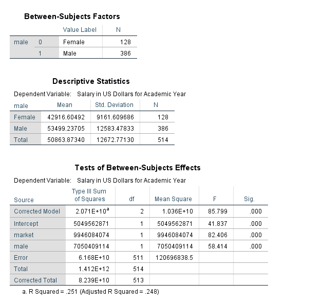
The table above indicates that the average salary for males is greater than the average salary for females ($53,499.24 compared to $42,916.60).
The table above indicates that the model fitted is significantly better than what we would expect by chance (F=85.799, pvalue<.001). The null hypothesis is that there is no linear relationship between faculty salary and the model predictors, and we reject this hypothesis. This is indicated by the line for ‘Corrected Model’. The R Squared value is also listed in footnote a. for the table. The proportion of variance in faculty salary explained jointly by marketability of discipline and gender is 25.1%. Notice that this is an increase from the previous model.
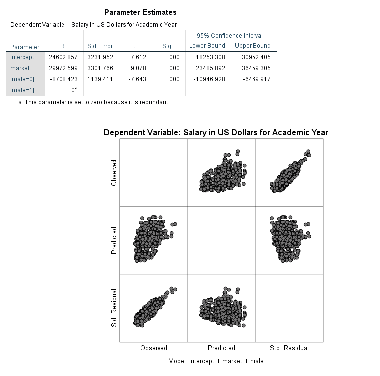
The table above provides the parameter estimates for the regression model. The difference in population mean salaries between men and women, when controlling for marketability is estimated to be $8,708.42.
Remember that Dummy variables are always interpreted in relationship to the reference category. The reference category is denoted with a coefficient value of 0 and footnote a. Here, we interpret male=0 (Female) compared to male=1 (Males). Another interpretation of the gender variable: When controlling for marketability, faculty salaries are on average $8,708.42 less for females when compared to males.
The marketability coefficient now is interpreted as the effect of marketability after accounting gender. For every one unit increase in marketability, faculty salary increases by an average of $29,972.60 holding gender constant. We could also interpret the beta coefficient for marketability the following way: the effect of a .1 point increase in marketability is associated with an estimated increase in mean salary of $2,997 holding gender constant.
Notice that all of the predictor variables in the model are highly significant.
Note that the model fit above is also sometimes referred to as an analysis of covariance (ANCOVA) model. The inclusion of a continuous predictor (marketability) in addition to the factor gender makes this an ANCOVA model.
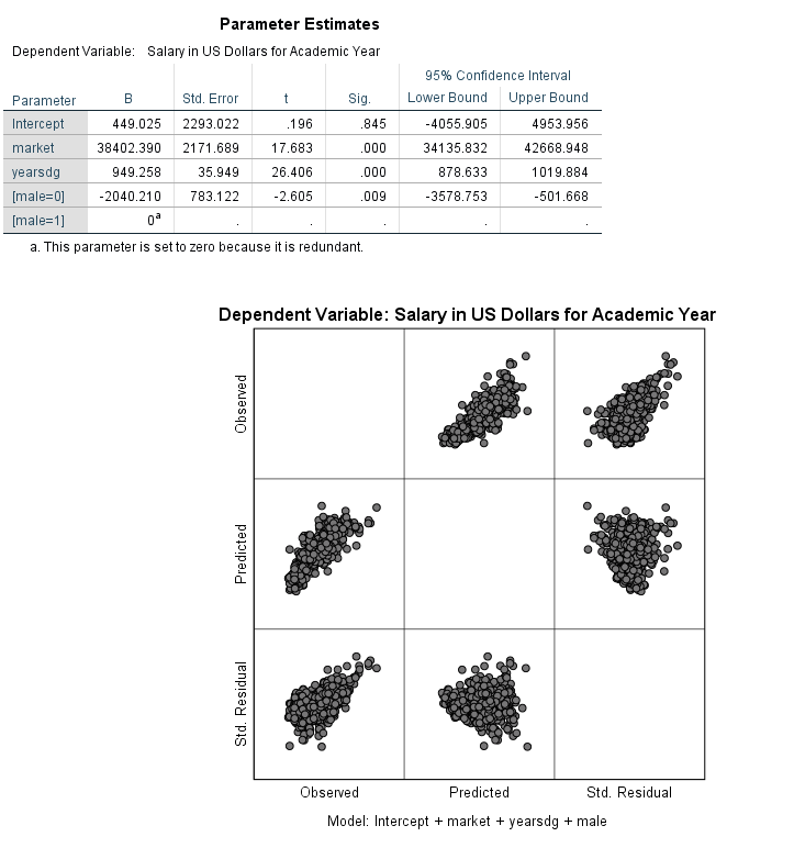
Create a multiple regression model where salary is the dependent variable, and marketability, time since degree (yearsdg), and gender are the predictors. Investigate the coefficients and R-squared.
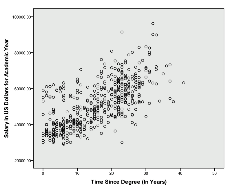
First investigate a scatter plot between salary and time since degree.
Select Analyze -> General Linear Model -> Univariate
Select ‘salary’ as the dependent variable, male as the fixed factor, and market and yearsdg as the covariates. Remember that any categorical predictor in a basic regression model should be entered in as a ‘fixed factor’, while any continuous prediction is considered a ‘covariate’.
Under ‘Options’, select ‘Descriptive Statistics’, ‘Parameter Estimates’, ‘Residual Plot’
The table below indicates that the R-squared value has increased from the last model to .684, and the model is significant (F=367.562, pvalue<.001).
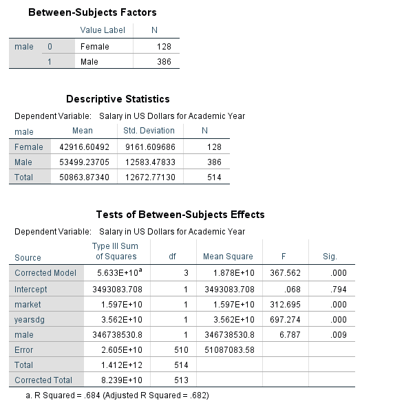
The estimated population mean salary for women is $2,040.21 less than men for a given marketability and time since degree. The estimated effect of time since degree is $949 more in mean salary per year (*a one unit increase is a year!) since degree when comparing faculty members of the same gender from disciplines with the same marketability. For a given time since degree and gender, a one unit increase in marketability is estimated to increase average salary by $38,402.
Notice that all of the predictor variables in the model are highly significant.
Activity 5: Multiple Regression with an Interaction
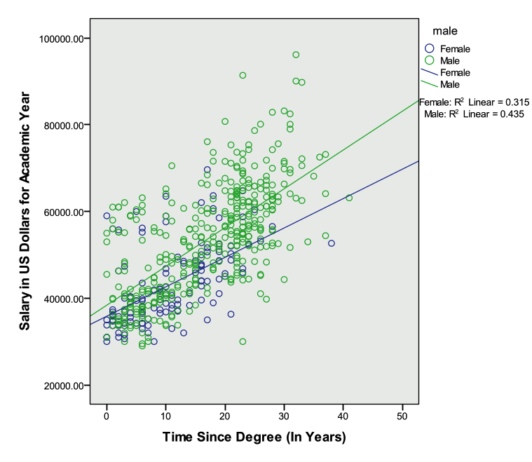
Faculty salary appears to be a function of the marketability of the discipline, time since last degree, and gender. Starting salaries could be similar for men and women, but men might receive larger increases over time. An interaction between gender and time since last degree may capture this relationship. Remember, a significant interaction implies that the effect of each variable depends on the value of the other variable—that is to say the effect of time since degree depends on gender and the effect of gender depends on time since degree.
Create a multiple regression model where salary is the dependent variable, marketability, gender, time since degree, and the interaction between gender and time since degree are the predictors.
Create a scatter plot: Select Graphs -> Legacy Dialogs -> Scatter/Dot and choose ‘Simple’ and ‘Define’. Let the y-axis be ‘salary’, the x-axis be ‘yearsdg’, and set markers by ‘male’. Select the graph in chart editor and click the box for ‘Add fit line at subgroups’. The lines for males and females are not parallel, and this is what we are investigating with the proposed interaction term.
Select Analyze -> General Linear Model -> Univariate
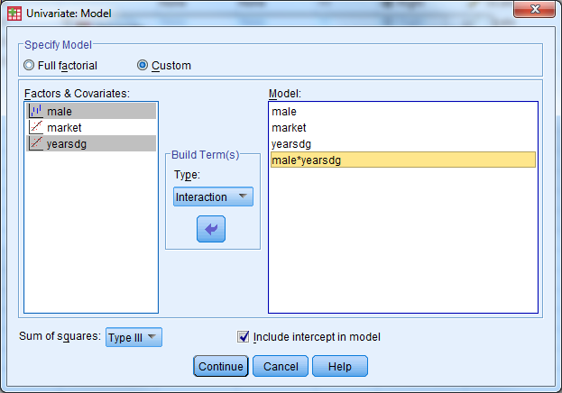
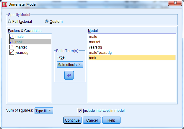
Select ‘salary’ as the dependent variable, ‘male’ as the fixed factor, and ‘market’ and ‘yearsdg’ as the covariates. Remember that any categorical predictor in a basic regression model should be entered in as a ‘fixed factor’, while any continuous prediction is considered a ‘covariate’.
Under ‘Model’, select ‘Custom’. Under ‘Build Terms’ select ‘Main Effect’ and enter the variables male, market, yearsdg. Under ‘Build Terms’ select ‘Interaction’ and select both male and yearsdg to create the interaction term. Select ‘Continue’. Remember that main effects must always be included in a model that contains interaction terms.
Under ‘Options’, select ‘Descriptive Statistics’, ‘Parameter Estimates’, ‘Residual Plot’

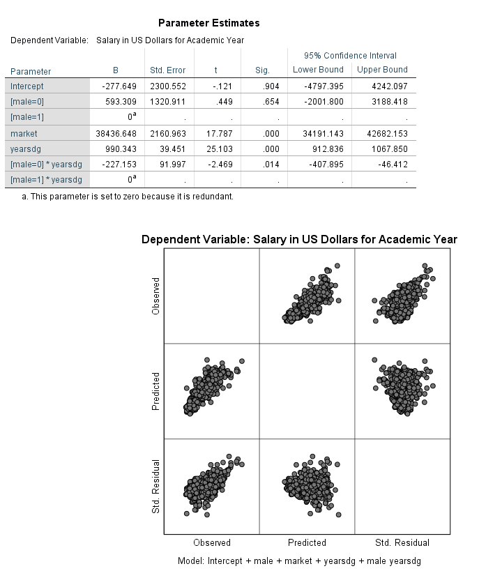
The table below indicates that the model is significant (F=279.95, pvalue<.001) and the R-squared has increased from the last model to .688.
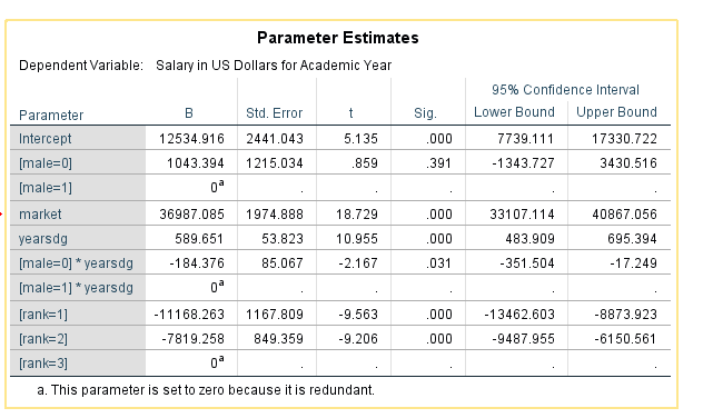
In the presence of interaction terms, the main effect terms have different interpretations. The estimated gender gap when time since degree is zero is not significant. When time since degree is 0 years, the population mean salary for women after adjusting for the other covariates in the model is estimated to be $593 more than men. Notice the confidence intervals range from negative values (women earn less at time since degree=0) to positive values (women earn more at time since degree=0).
The interaction between gender and years since degree (the change in gender gap with years since degree) is significant. For every additional year since degree completion, we see the gender gap between males and females grows by $227.153 on average when adjusting for the other covariates in the model.
Activity 6: Multiple Regression with Diagnostics
This exercise builds on the previous model. Add faculty rank (a three level categorical predictor) to the model and run the regression with diagnostics.
Create a multiple regression model where salary is the dependent variable, marketability, gender, time since degree, faculty rank, and the interaction between gender and time since degree are the predictors.
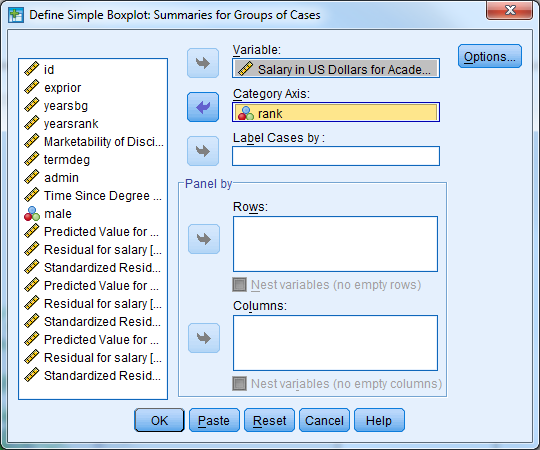
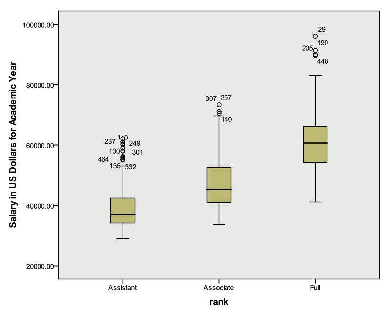
Create a side-by-side box plot for salary by rank.
Select Analyze -> General Linear Model -> Univariate
Select ‘salary’ as the dependent variable, ‘male’ and ‘rank’ as the fixed factors, and ‘market’ and ‘yearsdg’ as the covariates. Remember that any categorical predictor in a basic regression model should be entered in as a ‘fixed factor’, while any continuous prediction is considered a ‘covariate’.
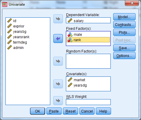
Under ‘Model’, select ‘Custom’. Under ‘Build Terms’ select ‘Main Effect’ and enter the variables male, market, yearsdg, rank. Under ‘Build Terms’ select ‘Interaction’ and select both male and yearsdg to create the interaction term. Select ‘Continue’. Remember that main effects must always be included in a model that contains interaction terms.
Under ‘Save’ select ‘Unstandardized Predicted Values’ and ‘Standardized Residuals’. Under ‘Options’, select ‘Descriptive Statistics’, ‘Parameter Estimates’, ‘Residual Plot’
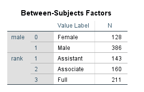
The table below displays the coding scheme used for the categorical predictors (factors).
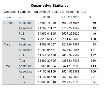
The table below provides the descriptive statistics for salary broken out by gender and rank.
The table below indicates the model is significant (F=242.32, pvalue<.001) and the R-squared value is .741 (an increase from the last model).
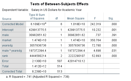
We can see from the table below that faculty rank is a significant predictor of salary. The table above indicates that rank=1=Assistant Professor, rank=2=Associate Professor, rank=3=Full Professor. The estimated difference in population mean salary between Assistant Professors and Full Professors is $11,168 after adjusting for the other covariates in the model. Put another way: Assistant professors earn on average $11,168 less than Full Professors, all else equal. The estimated difference in population mean salary between Associate Professors and Full professors is $7,819 after adjusting for the other covariates in the model. Put another way: Associate professors earn on average $7,819 less than Full Professors, all else equal.
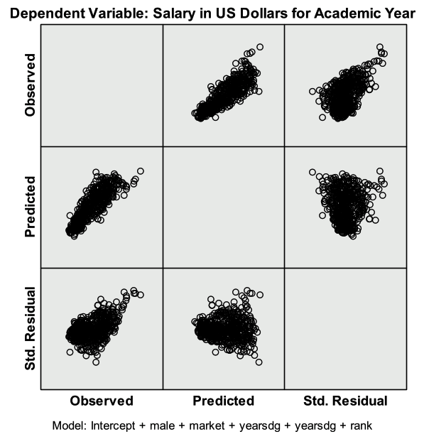
The residual plot below is given from the output. First investigate the predicted (x axis) vs. std. residual plot to check for the constant variance assumption. There is not strong evidence that the assumption of constant variance has been violated. Linearity can also be assessed with this plot. Next investigate the plot of observed (x axis) and predicted values (y axis) to check the linearity assumption. The points should be symmetrically distributed on a diagonal (45 degree) line if the linearity assumption is not violated (this is approximately what we see here). Note that these plots could be made manually by creating scatter plots from the saved variables (predicted, residuals).
The GLM approach to regression doesn’t allow for VIF’s to be calculated directly. Multicollinearity can attempt to be assessed through investigating the correlations or calculating the VIF manually. Note that pairwise correlations do not fully capture multicollinearity.
Select Analyze -> Descriptive Statistics -> QQ Plot and select the residual variable. The plot below indicates that the distribution of the error terms is approximately normal. This can also be confirmed with a histogram.
5.3.7 Exercise A5 – Case Study II: AIDS (Logistic Regression)
Open exercisea5_data
Background
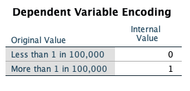
The data set for this exercise contains information on 109 countries with a number of characteristics measured for each country. The goal of the exercise is to identify whether there may be characteristics of a country that are related to AIDS rate classification. Countries are divided into one of two AIDS rate groupings: 0 = Less than 1 in 100,000 or 1 = More than 1 in 100,000. The variable in the data which holds this information is called aidscat2.
We will fit several models with AIDS rate category as our outcome to identify potential significant predictors of AIDS rate classification. Because the model outcome is no longer a continuous measure, but instead binary, a logistic regression model will be used. The outcome for this type of model isn’t actually the values of the variable (0 or 1) but instead a calculation of the probability of having the value of one of the two categories of the outcome. The model has the form:
\[ \ln\left( \frac{p}{1 - p} \right) = \beta_{0} + \beta_{1}x_{1} + \beta_{2}x_{x} + \ldots + \beta_{p}x_{p}\ \]
where p is the probability of the outcome variable being equal to 1. The \(\ln\left( \frac{p}{1 - p} \right)\) outcome is known as the log-odds.
Note: It is possible to change which level of the outcome variable the probability references, so you can model the probability that y=0 instead of y=1 if desired.
In all models for this exercise we will consider predicting the probability that a given country will have the higher AIDS rate classification (aidscat2=1). The objective of the models is to see whether the included predictors are significantly associated with the probability of having the higher AIDS rate classification.
Activity 1: Logistic Regression with a Continuous Predictor
For the first example, we will look at a simple example of fitting logistic regression with a continuous predictor. We will consider a single continuous predictor (log base 10 of the gross domestic product per capita, LOG_GDP).
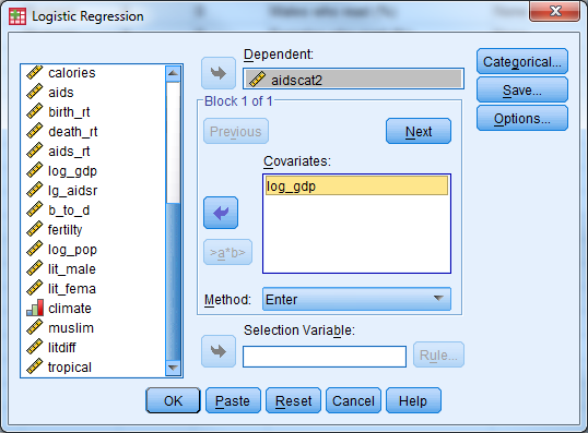
Perform a simple logistic regression where ‘aidscat2’ is the outcome variable and ‘log_gdp’ is the independent/predictor variable.
Select Analyze -> Regression -> Binary Logistic’ to open the logistic regression dialogue box.
Select AIDSCAT2 as the binary dependent variable. Note that the category whose probability we want to model, “high” AIDS rate, is coded as a 1, and the other category, “low” AIDS rate, is coded as 0. SPSS automatically fits the highest valued category probability. If the opposite is desired the outcome variable should be recoded so the opposite category has a higher value. Select LOG_GDP as the only covariate, and click OK to fit the model. Results from fitting this model are included below.
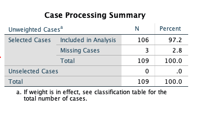
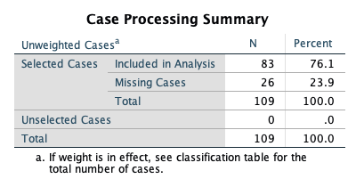
The first table rovides some information regarding the cases (rows) used to fit that data. Note that three cases were lost in the analysis, due to missing data on the AIDSCAT2 variable. The final analysis sample size was 106.
The coding of the dependent variable is critical to understand. SPSS will model the probability that the “internal value” of the dependent variable is equal to 1. The “internal value” is the value that SPSS recodes the outcome to be to fit the model behind the scenes. This will not always match up to your original coding so check this table carefully. In our case the 0/1 internal coding that SPSS performs matches up with our original 0=less than 1 in 100,000 and 1=more than 1 in 100,000 coding so we will be modeling the probability of being in the “high” AIDS rate.
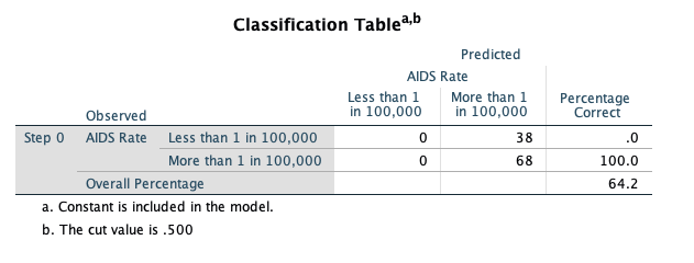
This initial classification table, located in “Block 0” of the output, shows how well we would do predicting by chance what the outcome will be (i.e., not using any covariates to predict the outcome). Because more countries have the higher classification, we would predict that classification for all of the countries, and we would be correct 64.2% of the time. This table isn’t all that informative by itself, we will compare it to a similar table in the next portion of the output.
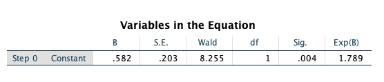
This table, also in the “Block 0” portion of the output, shows the maximum likelihood estimate of the intercept term in a logistic regression model without any covariates. This is simply the computed log-odds of the dependent variable being equal to 1.
We’ll scroll down to the “Block 1” portion of the output, which will contain the maximum likelihood estimates of the parameters in our model. These estimates describe the relationship of LOG_GDP to the dependent variable (aidscat2). First, we examine the classification table for our outcome given that we are now considering the LOG_GDP variable as a predictor. This table is similar to predicted values in linear regression. For each country in the data set the predicted probability is computed using the fitted model and values of the country’s covariate. If the predicted probability is greater than 0.5 the country is classified into the ‘high’ AIDS rate group and if it is less than 0.5 it is classified into the ‘low’ AIDS rate group. These classifications are then compared with the actual observed classifications of the countries.
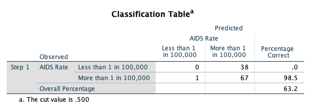
Note that we are actually doing a worse job of predicting the AIDS rate when using LOG_GDP as a predictor (63.2% correct vs. 64.2% correct when we don’t consider any covariates). The predicted probabilities can be saved in the SPSS data set as an option if desired.
Now, we examine the maximum likelihood estimate of the coefficient for LOG_GDP in the logistic regression model:
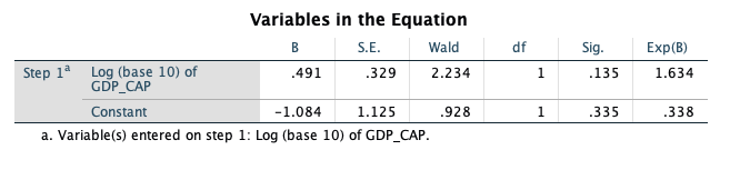
The estimate of the parameter that represents the coefficient for LOG_GDP in the model is equal to 0.491, with a standard error of 0.329. The Wald statistic reported by SPSS is the squared version of the T statistic (the coefficient divided by its standard error, squared), and is referred to a chi-square distribution with 1 degree of freedom. This Wald statistic has a p-value of 0.135, which suggests that we would not reject a null hypothesis that the coefficient for LOG_GDP is equal to 0. We really don’t have evidence of a significant relationship of LOG_GDP with the AIDS rate outcome.
However, if the relationship were significant, we would conclude that a one-unit increase in LOG_GDP results in an expected increase of 0.491 in the log-odds of being in the higher AIDS rate category. The parameter estimates represent additive changes to the log-odds. If exponentiated we get the more common odds ratio, which is the multiplicative change to the odds. Here the Exp(B) column holds the exponentiated esimates, for log_gdp the odds ratio is equal to 1.634. This value has the meaning that the odds of being in the higher AIDS rate category are multiplied by 1.63 with every one-unit increase in LOG_GDP.
Activity 2: Logistic Regression with a Categorical Predictor
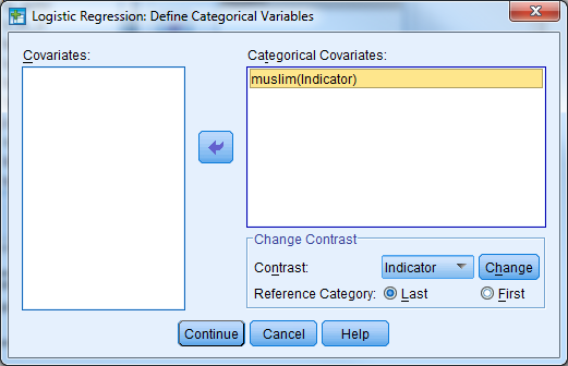
Now, we’ll consider an example of analyzing a single categorical predictor with two levels, whether or not the country is predominantly muslim (MUSLIM). MUSLIM is coded as 1 = yes and 0 = no, which we would recommend for any two-level predictors.
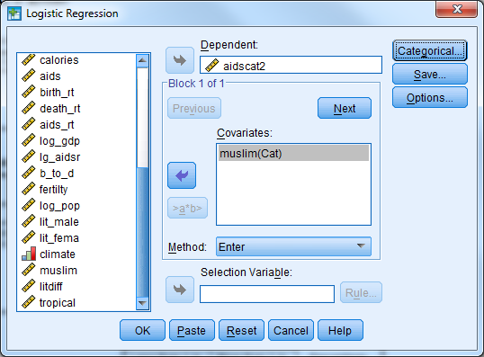
Select Analyze -> Regression -> Binary Logistic to re-enter the logistic regression dialogue box. Replace the log_gdp covariate with muslim. We need to identify the predictor as categorical so select the categorical button. Move the MUSLIM covariate into the ‘Categorical Covariates’ list.
Fit the logistic regression model by clicking on OK.
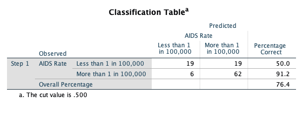
Let’s jump down to Block 1 in the output and first examine the classification table based on the model including the MUSLIM variable:
Note the substantial improvement in prediction accuracy by considering Muslim status! Now, we investigate the maximum likelihood estimate of the coefficient for MUSLIM:
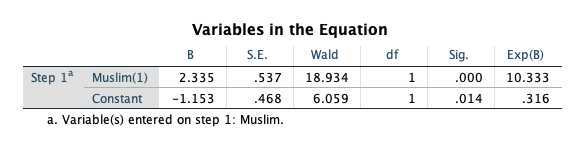
The maximum likelihood estimate of the coefficient is -2.335, with a standard error of 0.537. The Wald statistic based on that estimate is 18.934, and the p-value for that Wald statistic is said to be 0.000 by SPSS (but should be reported as p < 0.001). This p-value suggests that we should reject the null hypothesis that the coefficient is equal to 0, which tells us that Muslim status has a significant relationship with the probability of being in the higher AIDS rate category. Specifically, when MUSLIM is equal to 1 (as opposed to 0), the log-odds of being in the higher category are expected to decrease by -2.335.
This estimate corresponds to an odds ratio of 0.097 (the exponential version of the coefficient), which says that the odds of having a higher AIDS classification for a Muslim country is 0.097 times the odds of having a higher AIDS classification for a non-Muslim country. The expected odds are multiplied by 0.097 when a country is Muslim as opposed to non-Muslim. We can also interpret this as reducing the odds of being in the higher AIDS rate category by 90.03% for muslim countries. Notice here, when we see a decrease in the odds (odds ratio less than 1) we report 1-Odds Ratio as the percentage (1-.097=.9003).
Activity 3: Logistic Regression with Multiple Predictors
In this analysis, we hope to find ways to categorize countries into one of two AIDS prevalence categories, based on other data for the countries. We will also discover which pieces of information are useful in predicting AIDS prevalence, and which appear to be unassociated with this prevalence.
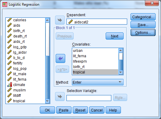
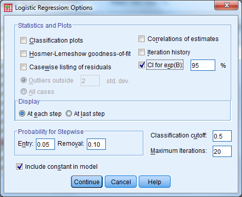
Set up a logistic regression model to predict AIDS prevalence category (aidscat2) by considering the following predictors: muslim, log_gdp, babymort, urban, lit_fema, lifeexpf, birth_rt, tropical. Have SPSS report confidence intervals for the odds ratios. (This is found under the ‘Options’ button in the Logistic Regression dialogue box.)
Which predictors appear useful in predicting AIDS category? Do Muslim countries still have lower odds of being in the higher AIDS prevalence category when controlling for the relationships of the other predictors with the outcome? How much lower are the odds of a Muslim country being in the higher AIDS category?
The first table shows us that only 83 countries are used to fit this model, 26 were removed from analysis due to missing data on any of the variables used.
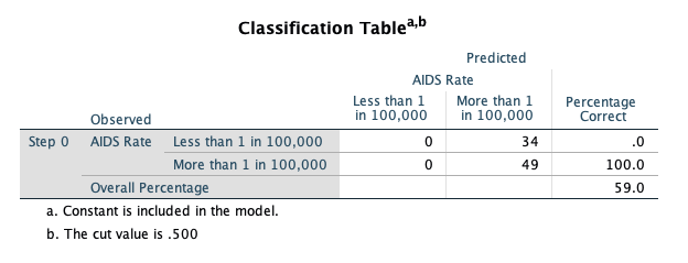
The first classification table (Block 0: Beginning Block) in the output shows you the result of classifying cases strictly by predicting them to be in the category with the largest percentage in the data set (in this case, you would predict a random case to be in the higher AIDS category, since 64.2% of the cases with a valid AIDS category are in the higher AIDS category). We would only be correct 59% of the time predicting by chance.
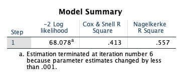
The ‘Model Summary’ table shows the –2 log-likelihood statistic for our model, as well as two analogs of R2 in the multiple regression context for a logistic regression model. These are approximations of R-squared in linear regression models, and should not be reported as the same thing; they should really only be used to compare the fits of competing models fitted using the same cases. The Cox & Snell R Square approximation suggests that our predictors explain about 41% of the variation in our response (not bad). The Nagelkerke R Square is a rescaled approximation that is constrained to fall between 0 and 1.
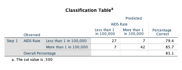
The Block 1 classification table shows an increase in the percentage that is correctly classified (83.1% vs 59%) using the predicted probabilities and a ‘cut-off’ classification probability of 0.5.
Let’s examine the estimated coefficients for the predictors included in our model:
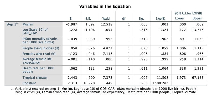
The B column contains the estimated coefficients in the logistic regression model, which indicate the change in the log-odds of “success” (in this case, being in the higher AIDS category) associated with a one-unit increase in each predictor. So, for example, a one-unit increase in Muslim (or being in a Muslim country) decreases the log-odds of being in the higher AIDS category by 5.987, holding all other predictors constant.
The Sig. column provides the results of a significance test for each of the parameters (or coefficients) for the predictors in the model. This shows that Muslim, lit_fema, and tropical are significant predictors of being in the higher AIDS category. If a predictor is significant, changes in the predictor have a significant relationship with the log odds of “success.” The Exp(B) column indicates the factor by which the odds of “success” are multiplied when the predictor increases by one unit, holding the other predictors constant. So, for example, a one-unit increase in Muslim will multiply the odds of being in the higher AIDS category by 0.003, or reduce the odds of being in the higher AIDS category by 99.7%. The Exp(B) factor is known as an odds ratio. The 95% confidence interval for Exp(B) will not contain 1 if the predictor is significant. An odds ratio of 1 means that one-unit changes in the predictor multiply the odds of “success” by 1, or effectively do not change the odds.
5.4 Final Project
The Data
The cars data sets contain data on specifications of 406 vehicles from 1970 to 1982. Among the variables in the data set are information on fuel consumption (mpg), horsepower, weight, acceleration, origin (Europe, Japan, U.S.), and number of cylinders.
The data set contains categorical variables (such as origin), numerical discrete variables (such as number of cylinders), and continuous variables (such as weight, and acceleration).
Getting Started
- Investigate cars_wave1.xls and cars_wave2.xls and prepare the data for SPSS
- Open SPSS and import cars_wave1.xls and cars_wave2.xls from Microsoft Excel.
- Merge cars_wave1 and cars_wave2 (add cases).
- Save this new SPSS file!
- Using the codebook below, define the proper attributes in Variable View
| Variable | Position | Label | Measurement Level | Missing Values |
|---|---|---|---|---|
| ID | 1 | Car ID Number | Nominal | |
| mpg | 2 | Miles per Gallon | Scale | 999 |
| engine | 3 | Engine Discplacement (cu. Inches) | Scale | |
| horse | 4 | Horsepower | Scale | |
| weight | 5 | Weight (lbs.) | Scale | |
| accel | 6 | Time to Accelerate from 0 to 60 mpg (sec) | Scale | |
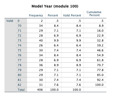
| year | 7 | Model Year (module 100) | Ordinal | |
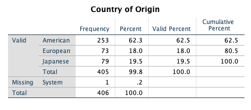
| origin | 8 | Country of Origin | Nominal | |
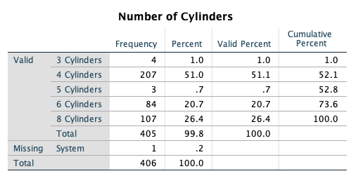
| cylinder | 9 | Number of Cylinders | Ordinal |
| Value | Label | |
|---|---|---|
| origin | 1 | American |
| 2 | European | |
| 3 | Japanese | |
| cylinder | 3 | 3 Cylinders |
| 4 | 4 Cylinders | |
| 5 | 5 Cylinders | |
| 6 | 6 Cylinders | |
| 8 | 8 Cylinders |
Working with Variables
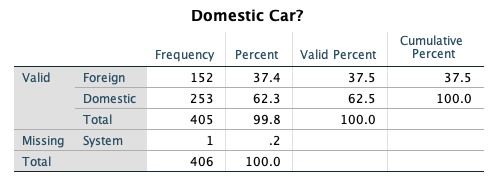
- Recode Origin such that 1=Domestic, 0=Foreign. Remember to recode into a different variable. Give this new variable the proper attributes in variable view.
- Convert Miles Per Gallon (MPG) to Liters Per 100 Kilometers
- Use the Compute function
- The formula to use: LP100K=(100*3.785)/(1.609*MPG)
- Export this SPSS data set to Microsoft Excel (it’s always good to have a back up!). Export all of the variables.
One Variable Procedures
- Get descriptive statistics for all scale variables in the data set.
- Get frequency tables for all categorical variables (ordinal or nominal) in the data set.
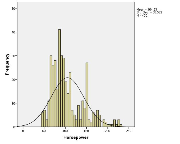
- Create a histogram of Horsepower.
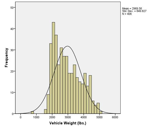
- Create a histogram of Weight.
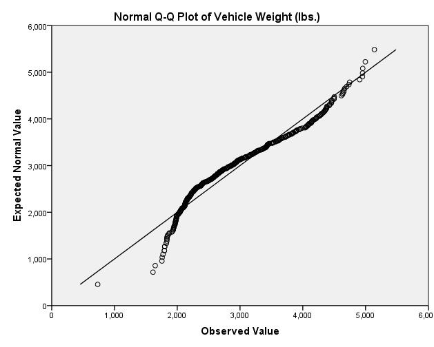
- Create a QQ-Plot for Weight (Analyze Descriptive Statistics QQ Plot Select Weight, leave others as default settings OK)
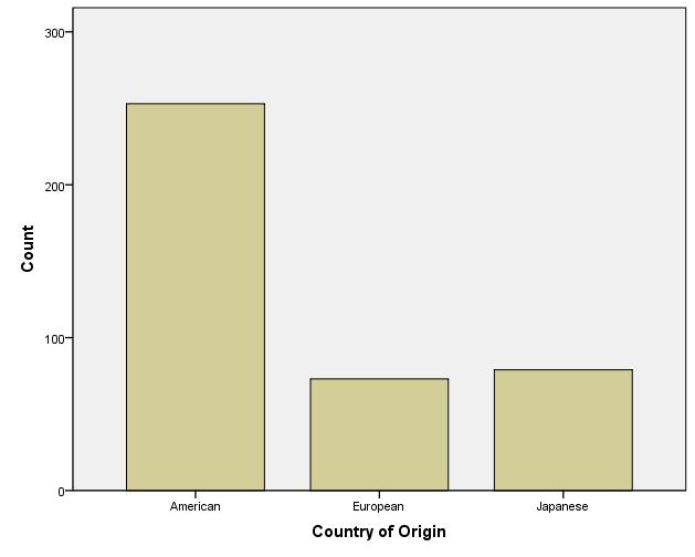
- Create a bar chart for Origin.
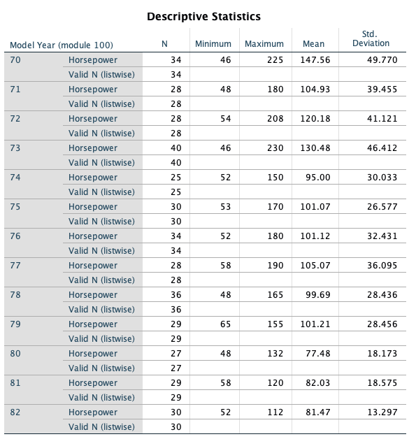
- Organize the output by Year (Analyzing groups of cases separately, compare groups). Before proceeding, select only cases with Year not = 0.
- Investigate Horesepower (descriptive statistics)
- Investigate Weight (descriptive statistics)
- What do you see?
- Remember to turn the Split File command off before proceeding!
Relationship Between Continuous Y (Horsepower) and Continuous X (Weight)
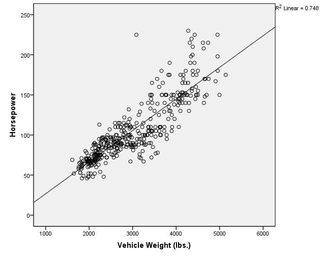
- Create a Scatter Plot with Horsepower as the Y variable and Weight as the X variable.
- Add a Linear fit line.
- What is the relationship between Horsepower and Weight as shown in this graph?
- Calculate the Pearson and Spearman Correlation coefficients for the relationship between Horsepower and Vehicle Weight.
- What is the p-value for the Pearson correlation?
- What is the actual p-value, as opposed to the p-value that is displayed? To display the actual p-value for the Pearson correlation, double-click on the Pearson correlation output table and double-click on the p-value. (Remember, p-values cannot actually be equal to zero. The p-value you will see displayed, after double-clicking, will be in scientific notation.)
Relationship Between Continuous Y and Numerical Discrete/Ordinal X
- Before doing any analyses, select only cases with Year not = 0.
- Create a side-by-side boxplot of MPG vs. Year. Choose MPG as the “variable” and Year as the “category axis”.
- What is the general trend of MPG across years?
Relationship Between Continuous Y and Nominal X
- Create a side-by-side boxplot of Miles per gallon vs Country of Origin (ORIGIN). (Note: even though Origin is numeric in the data set, its values are nominal: American, European, Japanese).
- What is the general relationship between MPG and the Origin of the car?
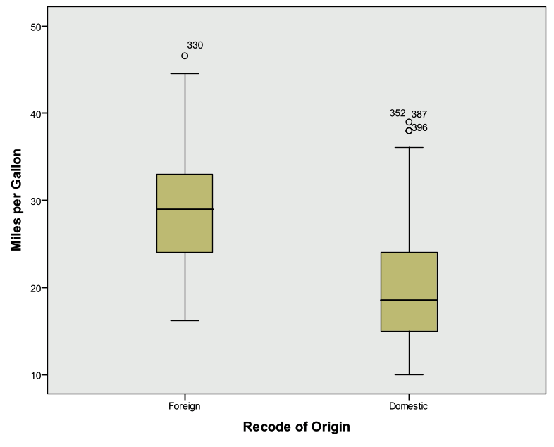
- Create a side-by-side Boxplot of Miles per gallon vs. the recoded Country of Origin (1=Domestic, 0=Foreign).
Final Steps
- Export the SPSS output into Microsoft Excel
- Select a few tables and/or charts that you would like to present and paste them into Microsoft Word
5.4.1 Final Project Solution
The Data:
The cars data sets contain data on specifications of 406 vehicles from 1970 to 1982. Among the variables in the data set are information on fuel consumption (mpg), horsepower, weight, acceleration, origin (Europe, Japan, U.S.), and number of cylinders.
The data set contains categorical variables (such as origin), numerical discrete variables (such as number of cylinders), and continuous variables (such as weight, and acceleration).
Getting Started
- Investigate cars_wave1.xls and cars_wave2.xls and prepare the data for SPSS
- Remove the first couple rows that contain a heading
- Remove the last row that contains summary information
- Save and exit
- Open SPSS and import cars_wave1.xls and cars_wave2.xls from Microsoft Excel.
- Open SPSS
- File -> Open -> Data Select “Excel” under File Type
- Browse for the Excel files and select Open
- Keep the box checked for “Read variable names from the first row of data”
- Leave the worksheet selected as the default
- Select OK
- Merge cars_wave1 and cars_wave2 (add cases).
- Data -> Merge Files -> Add Cases
- Select the open data file, then select Continue
- The Add Cases dialog will appear
- There should not be any “unpaired” variables
- Select OK
- Your active data file should now have 406 cases
- Save this data file and close the “non active” file
- Save this new SPSS file!
- Using the codebook below, define the proper attributes in Variable View
- Be sure to include the missing value code for MPG
- You only need to modify the measurement type, variable labels, variable values, and missing values.
Working with Variables:
- Recode Origin such that 1=Domestic, 0=Foreign. Remember to recode into a different variable. Give this new variable the proper attributes in variable view.
- Transform -> Recode into different variables
- Select Country of Origin (ORIGIN)
- Name = Domestic
- Label = Domestic Car?
- Select the Change button
- Select the Old and New Values button
- Old Value: Value: 1
- New Value: Value: 1
- Select Add
- Old Value: Value: 2
- New Value: Value: 0
- Select Add
- Old Value: Value: 3
- New Value: Value: 0
- Select Add
- Old Value: Value: System or User Missing
- New Value: Value: System Missing
- Select Add
- Select Continue
- Select OK
- Go to Variable View and enter 1=Domestic, 0=Foreign under Values for this new variable. Also adjust the decimal place to 0.
- Convert Miles Per Gallon (MPG) to Liters Per 100 Kilometers
- Use the Compute function
- The formula to use: LP100K=(100*3.785)/(1.609*MPG)
- Transform -> Compute Variable
- Target Variable = LP100K
- Numerical Expression: (100*3.785)/(1.609*MPG)
- Select OK
- Go to Variable View and give this variable a label (Liters Per 100 Kilometers)
- Export this SPSS data set to Microsoft Excel (it’s always good to have a back up!). Export all of the variables.
- File -> Save As
- Change Files of Type to Excel
- Give a name and select location to save
- Save
One Variable Procedures:
- Get descriptive statistics for all scale variables in the data set.
- Analyze -> Descriptive Statistics -> Descriptives
- Select
- mpg
- engine
- horse
- weight
- accel
- lp100k
- Select OK
- Get frequency tables for all categorical variables (nominal/ordinal) in the data set.
- Analyze -> Descriptive Statistics -> Frequencies
- Select
- year
- origin
- cylinder
- domestic
- Select OK
- Create a histogram of Horsepower.
- Graphs -> Legacy Dialogs -> Histogram
- Variable: Horsepower
- Check the box to display normal curve
- Select OK
- Investigate output
- Create a histogram of Weight.
- Graphs -> Legacy Dialogs -> Histogram
- Variable: Weight
- Check the box to display normal curve
- Select OK
- Investigate output
- Create a QQ-Plot for Weight (to help assess normality)
- Analyze -> Descriptive Statistics -> QQ Plot
- Select Weight, leave others as default settings
- Select OK
- Create a bar chart for Origin.
- Graphs -> Legacy Dialogs -> Bar
- Simple, summaries for groups of cases
- Select Define
- Select Origin for the Category Axis
- Select OK
- Organize the output by Year (Analyzing groups of cases separately, compare groups). Before proceeding, select only cases with Year not = 0.
- Investigate Horsepower (descriptive statistics)
- Data -> Select Cases
- Select If Condition is Satisfied (select If button)
- Enter this condition: year ~= 0
- Select Continue
- Output: Filter out unselected cases
- Select OK
- Data -> Split File
- Select Compare Groups
- Select Model Year (YEAR) for “Groups Based On”
- Select “Sort the file by grouping variable”
- Select OK
- Analyze -> Descriptive Statistics -> Descriptives
- Select Horsepower
- Select OK
- Investigate Horsepower (descriptive statistics)
- Investigate Weight (descriptive statistics)
- Analyze -> Descriptive Statistics -> Descriptives
- Select Weight
- Select OK
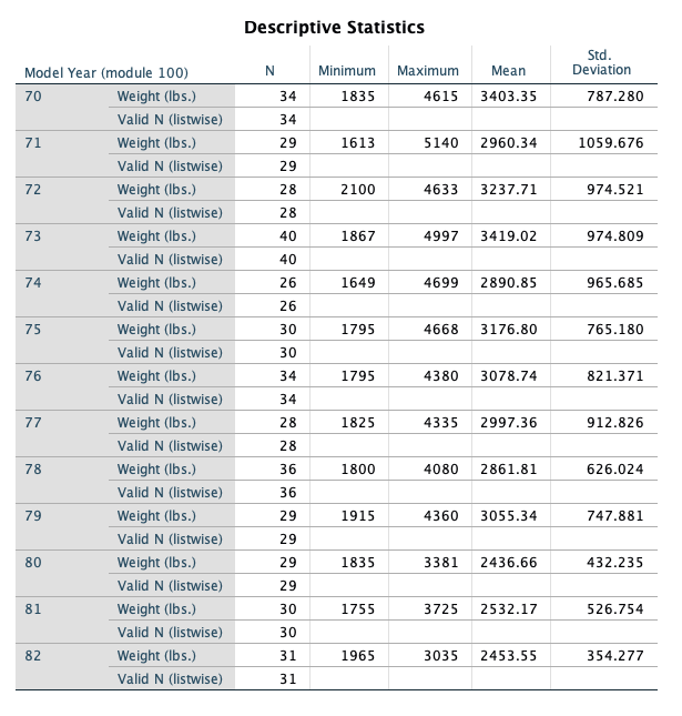
- What do you see happening in these two variables over time?
- It appears that the average horsepower and average weight are decreasing over time
- Remember to turn the Split File command off before proceeding!
- Data -> Split File
- Select Reset
- Select OK
Relationship Between Continuous Y (Horsepower) and Continuous X (Weight):
- Create a Scatter Plot with Horsepower as the Y variable and Weight as the X variable.
- Add a Linear fit line.
- Graphs -> Legacy Dialog -> Scatter/Dot
- Simple Scatter
- Select Define
- Y Axis: Horsepower
- X Axis: Weight
- Select OK
- Double click on the chart in the Output Viewer to open Chart Editor
- Select “Add Fit Line at Total” Button (lowest row, 5th object inward)
- The defaults are sufficient, so close out of the “Add Fit Line at Total” dialog
- Close out of chart editor
- Add a Linear fit line.
- What is the relationship between Horsepower and Weight as shown in this graph?
- There is a strong positive linear relationship
- Calculate the Pearson and Spearman Correlation coefficients for the relationship between Horsepower and Vehicle Weight.
- What is the p-value for the Pearson correlation?
- Analyze -> Correlate -> Bivariate
- Select Horsepower and Weight
- Select Ok
- The pvalue is listed as .000
- What is the actual p-value, as opposed to the p-value that is displayed? To display the actual p-value for the Pearson correlation, double-click on the Pearson correlation output table and double-click on the p-value. (Remember, p-values cannot actually be equal to zero. The p-value you will see displayed, after double-clicking, will be in scientific notation.)
- 1.18068E-120
- What is the p-value for the Pearson correlation?
Relationship Between Continuous Y and Numerical Discrete/Ordinal X:
- Before doing any analyses, select only cases with Year not = 0.
- Data -> Select Cases
- Select If Condition is Satisfied (select If button)
- Enter this condition: year ~= 0
- Select Continue
- Output: Filter out unselected cases
- Select OK
- Create a side-by-side boxplot of MPG vs. Year. Choose MPG as the “variable” and Year as the “category axis”.
- Graphs -> Legacy Dialogs -> Boxplot
- Simple, Summaries for groups of cases
- Select Define
- Variable: MPG
- Category Axis: Year
- Select OK
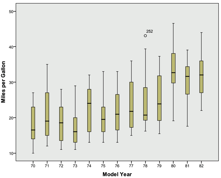
- What is the general trend of MPG across years?
- The median MPG appears to increase over time
Relationship Between Continuous Y and Nominal X:
- Create a side-by-side boxplot of Miles per gallon vs. Country of Origin (ORIGIN). (Note: even though Origin is numeric in the data set, its values are nominal: American, European, and Japanese).
- Graphs -> Legacy Dialogs -> Boxplot
- Simple, Summaries for groups of cases
- Select Define
- Variable: MPG
- Category Axis: ORIGIN
- Select OK
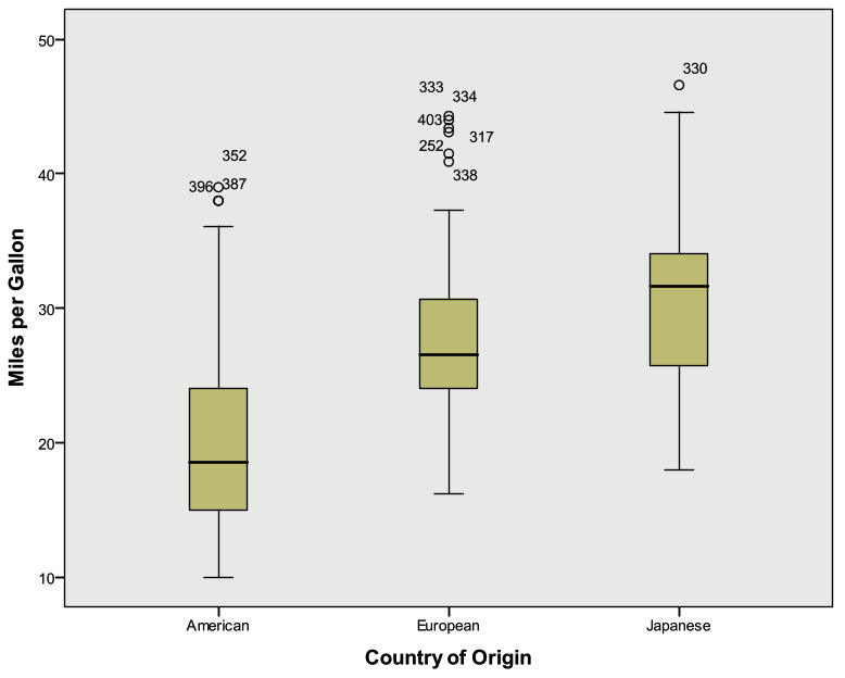
- What is the general relationship between MPG and the Origin of the car?
- The median MPG appears to be larger for European and Japanese cars when compared to American cars
- Create a side-by-side Boxplot of Miles per gallon vs. the recoded Country of Origin (1=Domestic, 0=Foreign).
- Graphs -> Legacy Dialogs -> Boxplot
- Simple, Summaries for groups of cases
- Select Define
- Variable: MPG
- Category Axis: RecodeOrigin
- Select OK
- Create a correlation matrix and scatter plot matrix for Horsepower, Weight, and Year. How strongly are these variables correlated?
- Graphs -> Legacy Dialogs -> Scatter/Dot
- Matrix Scatter
- Define
- Select Horsepower, Weight, Year under Matrix Variables
- Select OK